Ever wondered how a Sales Dashboard work? 🧐
Every company has objectives. 🎯 However, regularly updating your statistics and metrics in respect to those goals might be time-consuming. Many sales applications have a sales dashboard that provides you with up-to-date, actionable sales data.
It will tell you just how near you are to reaching your present sales goals. And where your sales plan may need to be tweaked! 👌
In this article, we’ll look at the 3 sales dashboards that every sales rep should have and how they can help you improve your prospecting process from start to finish.⚡
What is the purpose of a Sales Pipeline Dashboard?
A standard dashboard, is a sales software that visualizes your most current performance indicators. It provides a succinct picture of performance parameters such as sales to date, sales by region, lead conversion rates, sales growth, and so on. 👍
It also allows you to measure activity-based data, such as contacts made, emails sent, and the average lead response time. 📩
Dashboards are a must-have tool for organizations looking to generate much revenue and prepare for future growth. Without one, you’re on your own to evaluate massive volumes of data. Attempting to collect all of those sales metrics manually would be a difficult undertaking, and the ultimate result would almost certainly contain inaccuracies. 😬
However, a sales dashboard, aggregates the most up-to-date and accurate sales-specific information into simply digestible visual representations. This saves you time while also removing the chance of human mistakes. 😣
Furthermore, it’s a platform that allows you to efficiently administer and monitor prospection KPIs in one single location, while also assisting Teams in meeting sales targets through an analysis of their performance. 📈
Sales reps must have strong ownership of their pipelines, data at their fingertips, and up-to-date information at all times. 🧐
The performance of the team, outreach opportunities, concluded approaches, numerous other sales KPIs, and lead management on a daily or strategic level become simplified and easier to track by using Dashboards on Waalaxy. ✨
PS: There will be a specific sales dashboard for Teams soon! 😀
Why Do You Need a Sales Dashboard?
Because time is limited, salespeople want information that rapidly provides a holistic perspective of their marketing actions, as well as the ability to swiftly go deeper into any data point—all without taking a significant amount of time or effort. 😓
Sellers spend the majority of their time in CRM tools since it has the information they require to close transactions. Prospect data, on the other hand, is sometimes buried on many screens, making it difficult to have an accurate, overall knowledge of a particular client. 😮
Therefore, sales dashboards enable salespeople to spend more time selling and less time on administrative activities or looking for data. That’s why automation tools are so important for your business to grow! 🚀
Sales reps, managers, and senior executives like to speak the same language and strive for the same sales KPIs. Using single sources of truth across teams ensures that key choices are made using facts rather than gut instinct. 👌
Using live data sources with clean and verified sales data, means you’re better prepared and never caught off guard, allowing everyone in the business to be more nimble and pivot rapidly to achieve quota or work opportunities more efficiently. 🤓
Thanks to sales dashboards, analysts can provide more precise sales projections, executives can plan territory more effectively, and salespeople can see exactly where they stand in relation to their targets. 🏹
3 Sales Dashboard Examples
Sales dashboards will enable sales metrics by providing a complete 360° overview of prospecting data, real-time data overview in terms of your target audience, visualizing your progress, and sharing the information with your colleagues. 🕺
Here is an overview of the top 3 sales dashboards that cover the most critical parts of a company’s prospection plan: 👇
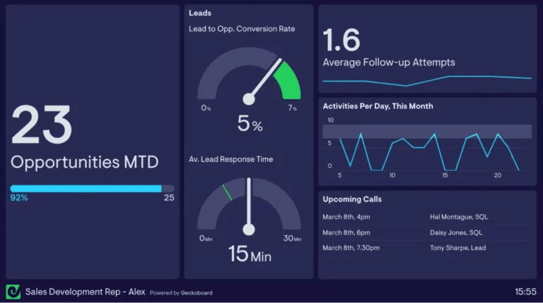
Use a Sales KPI Dashboard to give Feedback
- Intended audience: Individual/team use.
- Focus metrics: Created opportunities vs. target, lead response time, and average follow-up efforts. 🙏
- Use case: It keeps them on track with their sales efforts and alerts them to any possible blind spots. During sales training and team meetings, sales managers may utilize this dashboard to give feedback, teach, and explore areas for growth.
Sales Performance Dashboard to track Revenue
- Intended audience: Team manager use.
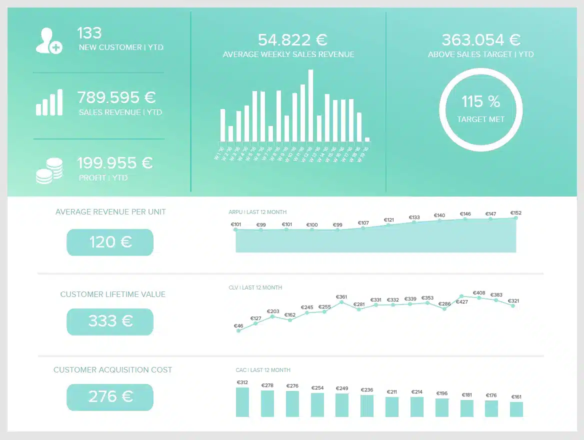
- Focus metrics: Customer acquisition cost (CAC), customer lifetime value, number of new customers, sales objective, average weekly sales revenue. 🤑
- Use case: The sales performance dashboard provides you with information about your team’s success over time. If you want to enhance your sales ops, look no further than the sales performance dashboard. You’ll be able to help your frontline sales personnel sell more efficiently with these actionable insights at your fingertips.
Sales Conversion Dashboard
- Intended audience: Sales team/manager use.
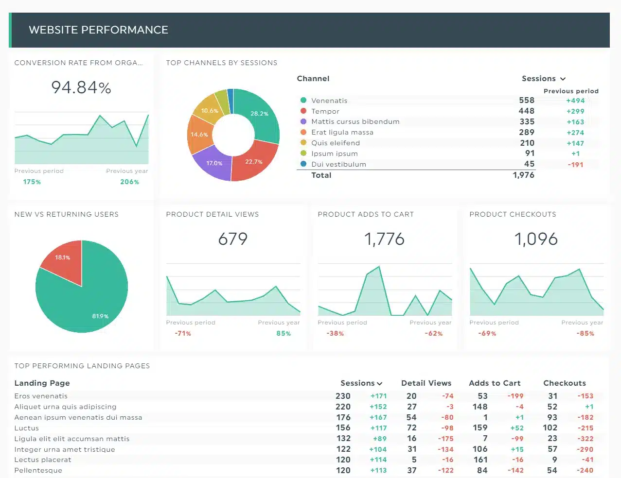
- Focus metrics: Conversion rate, lead-to-opportunity ratio, opportunity-to-win ratio, churn rate, and loss rate are all terms used to describe how well a website converts leads or “buyer personas” into opportunities. 🔍
- Use case: The sales conversion dashboard displays the efficiency with which your sales staff converts leads into paying clients. Info like adds to cart, and checkouts are the metrics to look for alongside the best-performing landing pages.
What Should a Sales Dashboard Include?
Because a sales dashboard visualizes your prospecting funnel, it should feature graphs and charts that bring your key performance indicators (KPIs) to life. 🔔
Depending on the sales reporting technology you use, you may want to put comments next to your KPIs for context, as well as a text box that outlines your sales insights and suggestions. ✍️
Sales dashboards may help you concentrate your sales teams, enhance performance, and make data-driven choices. Use the following dashboards as inspiration, and starting points—and then personalize them to your own company requirements by crossing data from Waalaxy and other analytics tools, like Power BI, Excel, Google Sheets etc. 🖥️
What Data Can I See Using a Tableau Sales Dashboard?
Dashboards for sales performance allow you to monitor both results-based and activity-based indicators. However, not every department and team member requires daily access to all data. 🤲
Sales dashboards may be configured so that you only view information that is relevant to your process. The following are some of the most typical KPIs found on a sales dashboard: 💫
- Regional sales,
- Sales to date,
- Sales per representative,
- The average buying price,
- Conversion rate of leads,
- % of sales completed,
- Quote-to-close,
- Opportunities available,
- Sales goals,
- Order value on average,
- Deals in the works,
- The rate of follow-up,
- Response time for the lead,
- And so on.
Again, the KPIs that your team members will view on a daily basis will be determined by management, or they can even be automatically programmed. 🤖
Later, we’ll go through what to put on your B2b sales dashboard and how to set it up for maximum productivity.
How to make a Sales Forecast Dashboard?
To begin creating effective sales dashboards that your sales team will utilize, consider your audience and the KPIs that are important to this target audience.
Before you begin, ask yourself the following questions: 💯
- Who is your target audience? Who is going to use this dashboard? Is this a dashboard designed for a sales executive, a sales manager, or a seller? Knowing your target helps you to concentrate on which sales KPIs to include. 🎯
- Which sales KPIs should you prioritize in your dashboard? Create a dashboard that displays certain sales KPIs (e.g., sales forecast, quota attainment, growth, etc.) and drill down into individual data points. Don’t try to cram all of your sales KPIs into a single dashboard, to avoid confusions. 🤯
- Is this dashboard linked to a real-time data source? Is the sales analytics team in charge of managing, certifying, and preparing this data source? How frequently should this dashboard be updated? ⌚
- How do you want to distribute this dashboard? Can folks sign up to receive a picture of it on a regular basis? Will it be hosted on an internal portal or integrated into your CRM? ♾️
Having a complete prospecting platform, like Waalaxy, makes it simple and scalable to create effective sales reporting that satisfies all of your audiences. 👂
Sales reps can stay focused on the broad picture, while still having access to critical facts on the ground, such as alerts for when teams have met the prospecting quota or their queue is empty, for example.
[maxbutton id=”21″ url=”https://chrome.google.com/webstore/detail/waalaxy-1-linkedin-automa/hlkiignknimkfafapmgpbnbnmkajgljh?hl=en” ]
How To Create a Sales Dashboard?
Every company that uses a sales dashboard will set it up differently in order to meet their own objectives. Gather some data before committing to a sales dashboard tool to obtain a complete picture of where your company is at the moment. 📸
Which of the following criteria are included in sales metrics?
Examine your objectives and try to figure out which metrics will be most valuable to your team members in their daily tasks. ✈️ To do so, ask them a few questions on their present perceptions of their performance:
- How many consumers do you lose on a month-to-month basis?
- What is the average deal size for the business you’ve won?
- What is your current win-to-loss percentage?
Make sure to talk about both KPIs that are based on results and KPIs that are based on activities. 🏃 It’s much like every other major undertaking. Breaking down a huge objective into smaller ones makes it easier to plan and strategize, making the overall goal more achievable.
Make a list of the metrics that each department would like to see on a daily, weekly, and monthly basis. Then give it a goal to go with it. Then, according to your company’s specific big picture goals, prioritize that list. ✅ This will assist you in selecting the program that best meets your requirements, allowing you more flexibility over the KPIs you measure.
3 Sales Dashboards Tips
After seeing these examples, if you are still feeling motivated to crunch some numbers and create reports by yourself… 🧐 Then, consider the following suggestions when you design your own sales dashboard:
Use a simple layout for your report
Do not use busy colors for your visuals; this will draw attention away from the data. Many dashboard technologies allow you to arrange your reports’ layout, like dark mode to further organize the information. 👀
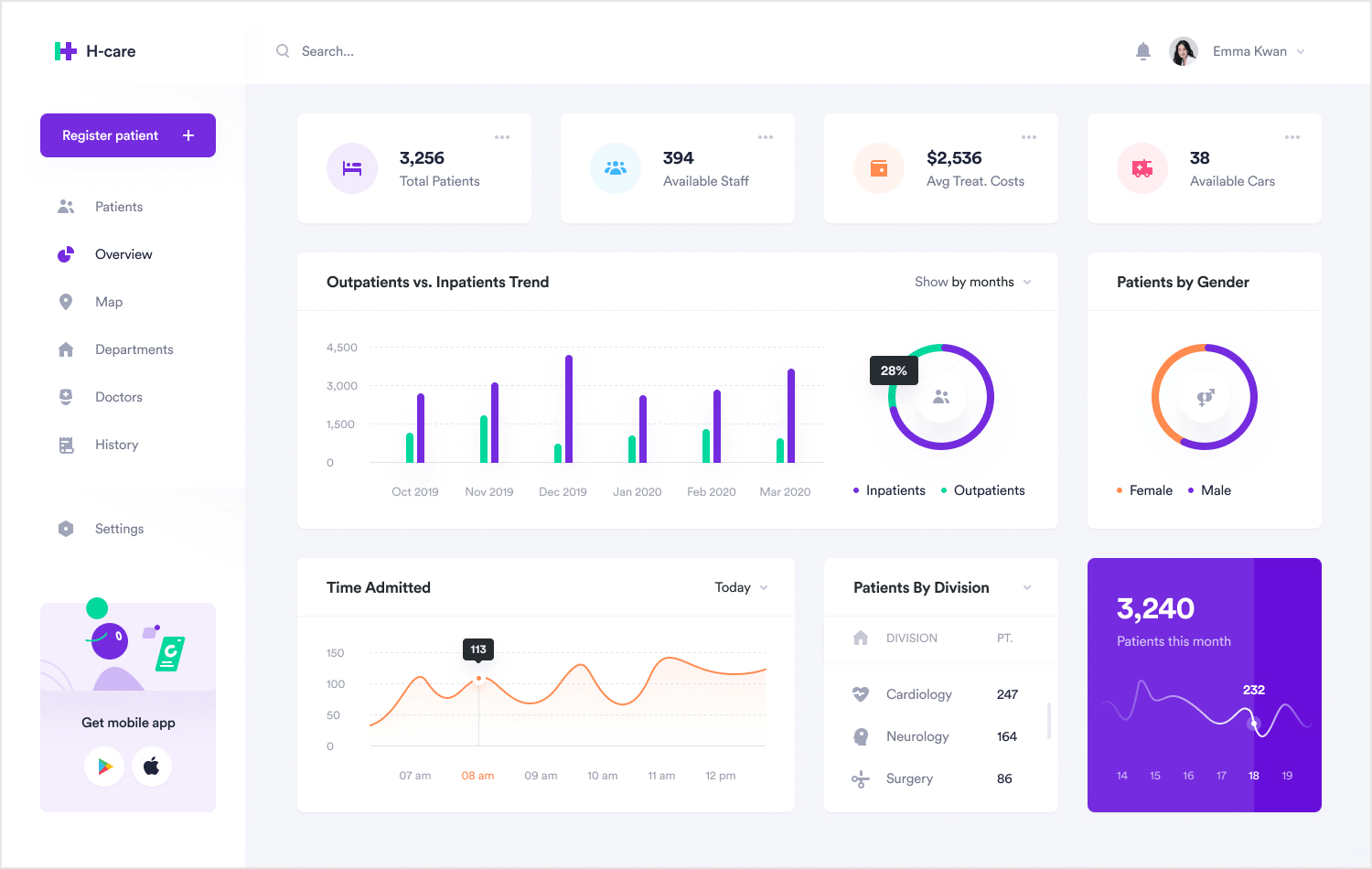
Place the most significant chart in the dashboard’s upper left corner — user experience research has shown that the left half of a webpage is more commonly visited than the right. With this information in mind, design a report flow that allows them to be read from left to right, with the most significant images on the left side of the dashboard. 👈
Add calculations (if applicable)
Calculations can help you save time by adding context to a report. You don’t want your employees to go to the hassle of conducting mental math to determine month-over-month sales increase, for example. 🧮
Allow access to the dashboard
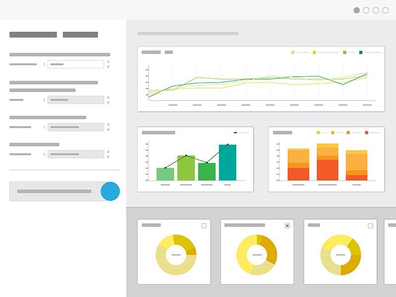
Make dashboards open to everybody, not only for sales managers, VPs, or executives, this way individual contributors may know which KPIs and goals are essential to the lead gen strategy. Transparency is one approach to drive your sales people since it allows them to zoom out and see how their figures affect the firm. 💧
With these pointers and tricks in hand, you’re ready to start creating your own sales dashboards! 🤩
Limits of using a Sales Dashboard Software
It might take a long time to learn new software, this called the “adoption of technology“. It’s vital to have an accurate picture of your team’s IT skills. 🥸 Also, consider how much time you have available to teach them on a new platform.
Some dashboards are designed to be user-friendly, while others have a high learning curve. Look for systems that have easy-to-use interfaces and a strong support system, including live chat help and a variety of training alternatives. 🙌
Choose a Dashboard Application
It’s time to shop around after you’ve created a prioritized list of KPIs that each department wants to see. 😃 As previously noted, sales dashboards are frequently part of a broader software platform. A dashboard is a feature included in many sales software packages, such as CRM and sales trackers.
It might be difficult to shop for software. If you’ve never used a sales performance dashboard before, it’s difficult to tell which platform is appropriate for you. 🤔 Keep a look out for CRM solutions that offer free trials while you search around. You’ll get the opportunity to try out their dashboard function. Also, get your feet wet with additional features that might help you better your client interactions.
You’ll need to input your company’s data once you’ve tested and chosen on the best sales dashboard platform. If you currently have a CRM, integrating these two business tools should be simple via Zapier, for example. 😉
If you don’t already have a CRM, it could be a good idea to merge your purchasing and marketing efforts into a two-pronged plan. As a result, a single, unified platform may provide you with greater benefits. 💰
However, if you don’t want the hassle of creating your own dashboard from scratch, then you can use an automation tool like Waalaxy, with built-in dashboards that are ready to view and are easily updated too. 🔥
Let’s see the details of the Waalaxy dashboards in the section below! 👇
Free Sales Dashboard Using Waalaxy
To demonstrate these advantages in action, I will show you the sales dashboard designs produced automatically with Waalaxy. 👽
First of all, I am happy to anounce that our LinkedIn automation tool is now available in “Freemium” version. You can find out more about our suscriptions, what they include and what are the advantages for each, then follow this link.
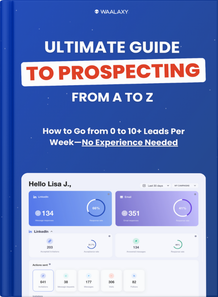
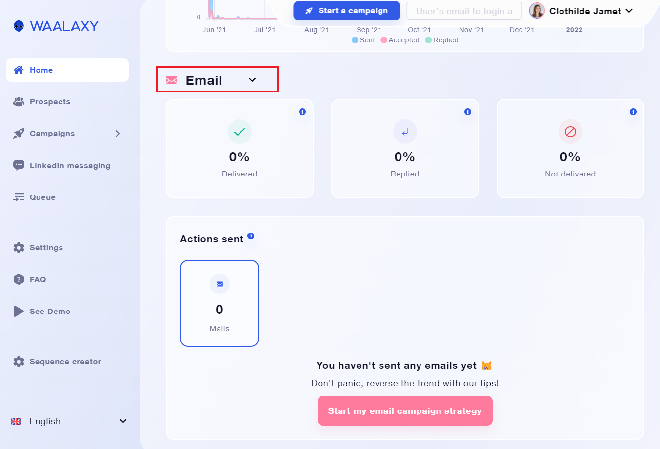
Secondly, let’s have a look at the homepage dashboard that appears in your Waalaxy app when you first open it. 🌟
- The upper part is divided into two sections of rate indicators: the reaction rate to LinkedIn activities messages on the left, and the response rate to emails sent via prospecting campaigns on the right. 👉
- You can filter the results by campaigns and you have more information on each, below these indicators.
- On the right side of the home page, you have your performace indicators for your prospecting campaigns and your ongoing queue of actions.
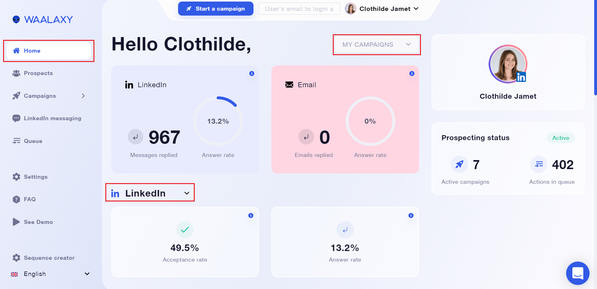
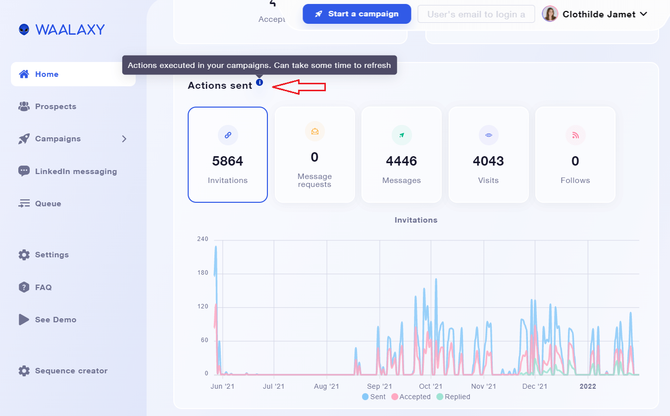
- Then, we have the “actions sent” section, that is updated automatically each day, as the rest of your graphics.
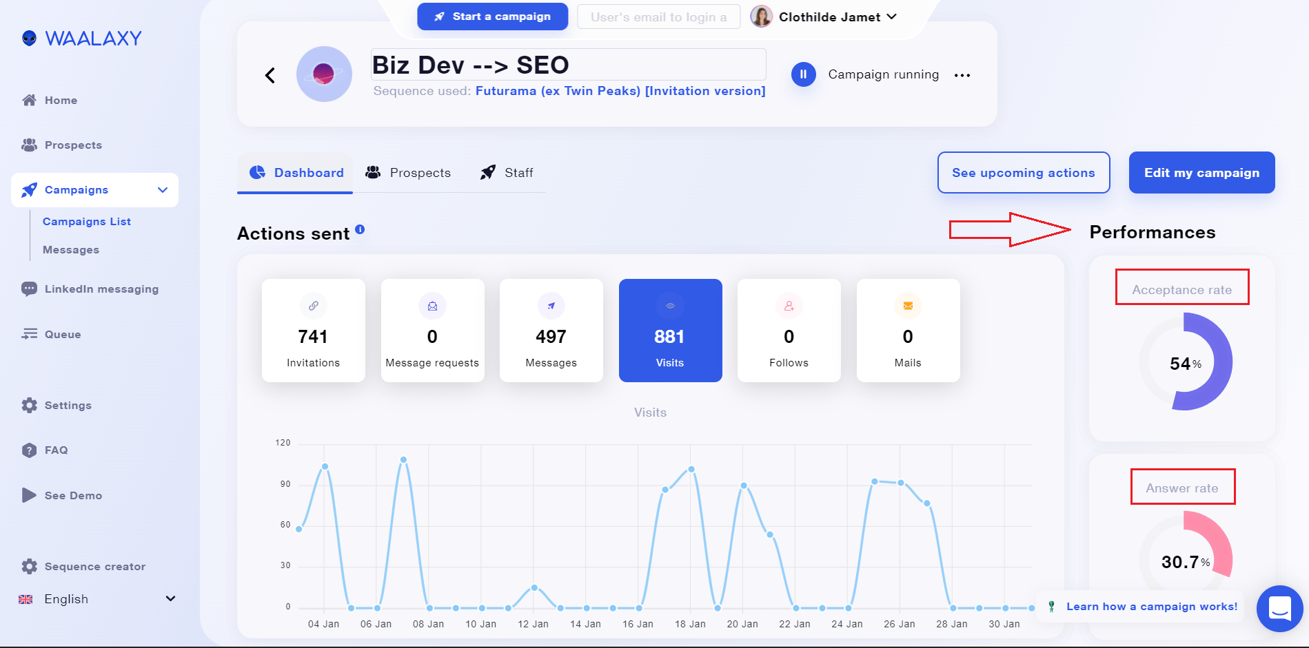
- The acceptance rate is a statistic that shows you how many individuals have accepted your connection request based on the total number of connection requests submitted. 🔗
- The response rate is the percentage of total messages sent that receive responses to messages, connection notices, and message requests.
- You can monitor and track the amount of actions sent by kind of action and date on a graphical dashboard: invites, message requests, messages, visits, and follows.
- Finally, we have the email-related data. This section contains information on the rate of replied emails, delivered emails, and undelivered emails.
- The sales emails that were delivered correlate to the emails that were appropriately delivered to your recipient’s main prospecting inbox.
- Not delivered emails are ones that are considered spam or have been rejected (=rebounced) by the recipient’s provider. 📨
Conclusion: Sales Dashboard
Here’s a little recap of the points we addressed in this article: 🎆
- What Is a Sales Dashboard?
- Why Do You Need a Sales Dashboard?
- 3 Sales Dashboard Examples.
- What Should a Sales Dashboard Include?
- How To Create a Sales Dashboard?
- 3 Sales Dashboards Tips.
- Free Sales Dashboard Using Waalaxy.
To sum up, it’s frequently said that having a prospecting campaign in place is critical for turning prospects into leads and getting the most out of them. ✌️
The performance indicators, which allow you to track and assess the success of your automated actions, are the second key factor to consider. 🗝️ This is how you’ll know whether your plan is working or needs some tweaking.
Make sure to use the right dashboard tools or combine as many as you need, to have at least 3 main sales dashboards to consult (Individual KPIs, Sales team performance and Conversion rates). 🚀
In order to improve your team’s performance and correct their course if needed!
FAQ: How to use a Sales Dashboard?
What is the acceptance rate vs. the response rate?
The acceptance rate is a statistic that shows you how many individuals accepted your connection request out of the total number of connection requests issued. 🛸
The response rate is the percentage of messages that receive a response compared to the total number of messages sent. It contains LinkedIn message answers, connection note responses, and message request responses. 🤗
These are the percentages that you see inside the “Performances” of your campaigns.
Can You Download a Sales Dashboard on Waalaxy?
It is not possible to export your dashboards at the moment, but you can kindly follow-up the incoming features for Dashboards and other topics, in our Public Roadmap. 🛣️ Or, let us know any improvement ideas by opening a support chat inside the Waalaxy app.
We’ll be glad to be hearing from you! 🥰
How Does the Campaigns Dashboard Work?
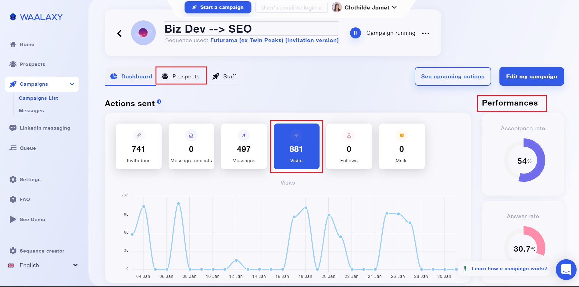
By clicking on the statistics of your current Waalaxy campaigns, you can keep track of them. Inside the campaigns, you’ll have access to a variety of metrics, including the graph, the performance, and the “Dashboard” & “Prospects” tab.
- The “Dashboard” tab gives you access to the “Performances”, which contains the rate at which your connection requests are accepted and the rate at which your messages are responded to.
- You may also get a graph that shows the amount of actions performed by type of action and date.
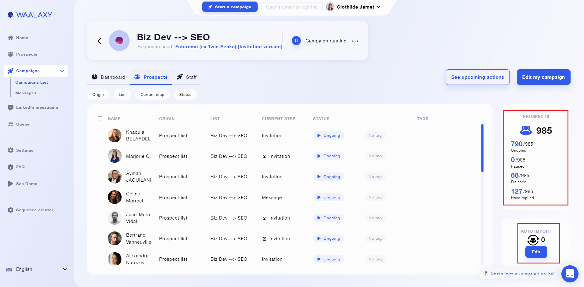
- Moreover, inside the “Prospects” tab, you will find your campaign’s prospect-customer list. As well as lead indicators like: the campaign’s overall number of leads, the number of leads that have been paused. The total number of leads that have been finished. The amount of leads who have replied. 👄
- You also have information on the Auto-imports that have brought leads to that specific campaign (if it’s the case).
Now you know everything about the Sales Dashboard, remember that you can now use Waalaxy for free even after your trial is over, so go ahead and enjoy. 🥳


