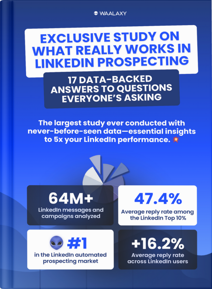
Call to action are important for your business because they motivate your audience to respond to a marketing campaign. 💥 The ultimate goal is to assist your target in the buying process, so they may eventually make a purchase.
Call to action Definition
A call to action (CTA) is a phrase or sentence that makes the reader take a specific action after reading it. 🤓
It can be an invitation to sign up for a newsletter, respond to a survey, purchase a product, click on a link, or share the article on social media.
The CTA is designed to create a sense of urgency and encourage the reader to engage with the content or take a desired action. 💥 It is a crucial element in marketing and content creation, as it helps to drive conversions and achieve business goals.
Furthermore, a call to action can be presented in several ways: ⏬
- Text link.
- Button.
- Plain text with no links.
💡 Simple calls to action are typically expressed as “Buy Now” or “Download Now.”
However, a CTA might also be longer, like “Subscribe today, so you’ll never miss a post.”
In fact, there are countless options. 🌌 We will show you a few of our favorite CTAs in this article!
Let’s go find out. 💃

Types of CTAs
Since there are different strategies you can employ to direct your audience along their customer journey, not all marketing campaigns use the same kinds of call to action. 🤔 A marketing campaign encouraging users to “Learn more” would use a button, while one aiming to increase newsletter subscriptions might use a submission form, for example.
Here are the main CTA types used in marketing: ⏬
CTA Buttons
CTA Buttons are icons with text written in them that encourage users to click and take further action. 💢 They are by far the most prevalent type of CTA. The style of the brand and the campaign’s objectives might influence button designs, but in general, your button should have a high contrast color to stick out on the page.
![]()
CTA Forms
Filling out forms by providing visitors with something in return for their contact information, CTAs turn site visitors into qualified leads. 😊 Offers might be in the form of quotes for goods or services, downloadable content, memberships, and more.

CTA Banners
A CTA banner may be positioned at the top, bottom, or the side of a website. 🌐 Usually, banners or display ads that have some sort of alluring language and design that entices viewers to click on them and take action.
![]()
Contextual Links CTA
Contextual links, which are typically found within the body copy of a post, have clickable language that leads visitors to an associated landing page. 🏹

Pop-Ups CTA
A pop-up is a call to action that unexpectedly displays in a small window on the page. 👀 Pop-ups can be an excellent approach to communicate an offer or persuade customers to sign up for your service because users frequently ignore static CTA buttons and forms. ⚠️ Exit intent pop-ups, which are activated when users are about to leave a website, are another common practice.
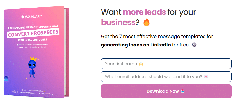
Slide-Ins CTA
Slide-in CTAs are designed to draw the user’s attention by “sliding in” from the bottom or the sidebar, much like pop-ups do. ⚡ Pop-ups can be replaced with slide-ins because they don’t interfere with the user experience as much.
👉 Remember that every company and audience are unique, so it may be helpful to A/B test different CTA types and designs to determine which ones are most effective for you.
How to create a compelling call to action for social media?
The goal of social media is to engage users by having them click on your content and advertisements. 🤩 It’s no longer as simple as it once was, though… Before, it only took one button that said “Click here” and people would click it!
Now, people use ad blockers to report pop-ups because there are “too many ads.” 😣 Besides, clicking on buttons is not recommended anymore, as it often leads to installing a virus inadvertently! Oops…
The world can be a harsh place sometimes. 🙈
However, you can increase your conversions and engagement by including a strong call to action in your ads and other online content to prevent this! 😉
Let’s take a look at how you can achieve this. 🔎
1. Put powerful words to use:
In order to do great advertising, you need to use a small amount of words, to create concise and compelling CTAs. 🏹 Not only is this more effective, but also necessary.
Let’s start with the verb “subscribe” and add the adverb “now” or the subject “newsletter”. 🧠
Here are two examples of calls to action using these statements: “Subscribe to our newsletter now”, or an even shorter version would be: “Subscribe Now.” ⚡
If we examined these examples, it would mean something like this: 👇
- “Subscribe” = Relevance.
- “to our newsletter” = Clarity.
- “now = Urgency.
- “Subscribe Now” = Take Action.
Plus, make sure the body text around your main call to action is used to:
- Lessen the distractions by removing extra links, adding emojis, etc.
- Reduce the worry of clicking on it (for example, make sure to add a mention like “No credit card required”).
👉 Furthermore, here’s a list of the most popular call to action verbs, organized by intention. 🪄 Simply combine them with your company’s offerings and create your own magic formulas:
| Intention | Call to action verbs |
| Ecommerce | Buy, Shop, Order, Reserve, Save, Add to Cart, Pick, View, Choose. |
| SaaS conversion | Try, Get Started, Subscribe, Sign Up, Test. |
| Non-profit conversion | Donate, Commit, Volunteer, Adopt, Give, Support, Help. |
| Newsletter or community | Subscribe, Join, Sign Up, Refer, Read. |
| Freebie giveaway | Download, Get, Grab, Claim, Take advantage of, Enjoy. |
| General | Learn More, See More, See How, Start Now, Find Out, Check it Out, Click here, Continue for More, Swipe Up, Click Here, Discover Now, Start Free Trial, Get Yours. |
2. Elicit feelings of excitement:
Choose a lengthier CTA if you want to elicit an emotional response from your users. 🥰 In order to achieve the desired result in this situation, you will need to use more modifiers.
Here are a few examples: ⏬
- Add real numbers: “Buy now and save 50%!”
- Put the right adjectives: “Find your dream home with us!”
- Give a clear goal: “Lose weight in just 6 weeks!”
- Make them feel FOMO by saying things like: “Limited time offer. Shipping is free!”
- Show your added value by saying: “Get your piece of hand-made jewelry now!”
3. Create unique CTAs for your business:
The best thing you can do is make up your own call to action by being creative! 🤗
First, tell yourself aloud what your business does for its clients (or just read your mission statement). 💯 For example, let’s imagine that you create unique hand-made jewelry and accessories.
Next, you need to create a 2–5 word call to action by using the verbs and modifiers, like we saw earlier. 🤓 Where appropriate, include pertinent information about your product or service. For example, “Get a free mystery jewelry with every purchase” or “Start your collection today of unique jewelry pieces!” 💍
NB: No one ever gets their CTAs right the first time. 👍 Run at least one A/B test on your advertisement (but preferably more) to determine the effectiveness of your call to action!
💡 As an example, here are a few CTAs that you can find in our Waalaxy software home page:
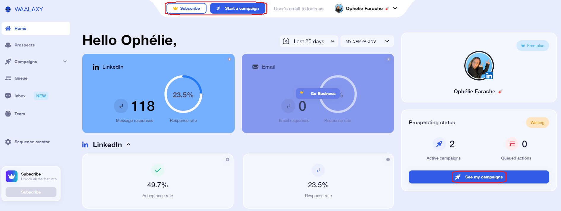
You can see that we like to use emojis and colors related to space, because this is part of our brand image. 🧑🚀
🔎 These CTA buttons are used to make the users create a campaign with our tool, so that this feature is always available from anywhere on the website.
Users can also see a “Subscribe” button, in order to upgrade to another plan very easily, that way we can make sure the conversions are hassle-free! 🤑
To get a better idea, let’s see the call to action examples below! 🔥
Best Call to action Examples
In this part, we will give you 5 examples for every category of call-to-action below. 🎯
👉 Here we go!
- Registration CTA, for example to a newsletter or to a service: 💌
- “Sign up to our exclusive newsletter/offer and get 10% off your next purchase!”
- “Join our community and never miss an update or announcement again!”
- “Shop now to take advantage of our limited-time sale!”
- “Don’t miss out – Register for our newsletter/upcoming event today!”
- “Let’s get in touch! Sign up for our newsletter today.”
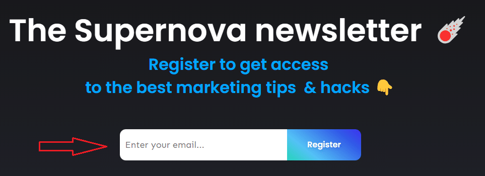
- Subscription CTA, on a streaming platform like Netflix, for example: 📹
- “Join now for a limited-time offer and get your first month for just $1.”
- “Sign up today and receive exclusive content straight to your inbox every week.”
- “Start your free trial today and enjoy the premium experience.”
- “Don’t miss out on the latest updates – Subscribe now and stay ahead of the game.”
- “Unlock premium features by subscribing today and take your experience to the next level.”

- Meeting request CTA, to finalize the purchase process with a salesperson: 🧲
- “Sign up today and receive 10% off your first purchase!”
- “Limited time offer! Buy now to secure your discount.”
- “Don’t miss out on this incredible deal. Schedule a meeting now.”
- “Our products are in high demand, act now and get yours at this exclusive offer.”
- “Take advantage of our limited time offer and purchase now to save!”

- Add to cart CTA, on an e-commerce website: 🛒
- “Add to cart and get free shipping on orders over $50″
- “Don’t miss out, add to cart now and save 10% on your purchase”
- “Add to cart and receive a complimentary gift with your order”
- “Limited time offer, add to cart and get 20% off your entire purchase”
- “Hurry, only a few left in stock! Add to cart before it’s too late.”
- Demo request CTA, for a software, for example: 🤖
- “Download our software now to see for yourself how it can streamline your workflow and increase efficiency!”
- “Sign up for a free demo today and experience the power of our prospecting tool firsthand.”
- “Don’t wait – Schedule a live demo with our expert team and discover new ways to maximize your productivity.”
- “Ready to take your business to the next level? Request a personalized demo and learn how our software can help you get there.”
- “Take the first step towards better workflow management by clicking here to start your free trial of our software today!”
- Additional information CTA, such as “Learn more”: 🧐
- “Click here to learn more!”
- “Sign up for our latest updates and exclusive content.”
- “Contact us for more information.”
- “Want to know more? Click here to start your free trial today.”
- “If you want to find out more about our products, visit our website.”

- Conversion CTA, used on a landing page like Waalaxy, for example: 🛬
- “Get your free trial now!”
- “Create an account and get exclusive offers!”
- “Buy now and get 20% off your first purchase!”
- “Join our community and start seeing results immediately!”
- “Download our e-book and learn the secrets to success!”
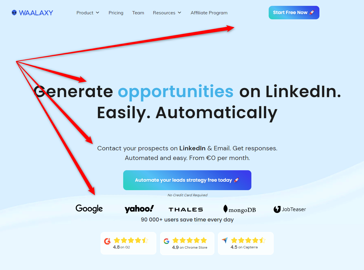
💡 As you can see, on the Waalaxy landing page you can find the following CTAs:
- a short “Start Free Now” button on the right-hand corner of the page,
- a plain text with no link “Generate opportunities on LinkedIn”,
- and a long button “Automate your leads strategy free today” in the middle.
All of these call-to-action are sure to boost our lead conversion rates! 😁
50 Powerful Call to Action Phrases
To give you even more tips on what call-to-actions to use, here are 50 powerful phrases you can copy-paste or adapt to your needs: ⏬
- Act now and take advantage of our limited-time offer.
- Don’t miss out on this incredible opportunity.
- Join the thousands of satisfied customers who trust us.
- Claim your free trial today.
- Start your journey to success with us.
- Upgrade to our premium plan to unlock exclusive benefits.
- Sign up today and receive a special discount.
- Discover the secret to success, sign up now.
- Take the first step to a better tomorrow by clicking here.
- Get started now and change your life.
- Reserve your spot before it’s too late.
- Get access to exclusive content by joining us.
- Try our product risk-free for 30 days.
- Take control of your future and join us today.
- Subscribe to our newsletter for valuable insights and updates.
- Start your free trial now and experience the difference.
- Join our community of successful achievers.
- Take action now and transform your life.
- Unlock your true potential by clicking here.
- Invest in your future and join us today.
- Start achieving your goals with our help.
- Click here to get started and change your life.
- Don’t wait any longer, join us now.
- Claim your free gift by signing up today.
- Discover the power of our product, try it now.
- Join us and become a part of our success story.
- Take advantage of our limited-time offer now.
- Invest in yourself and your future by signing up.
- Get instant access to our proven strategies.
- Start your journey to success with a single click.
- Get results faster with our effective solutions.
- Don’t let this opportunity pass you by, join us now.
- Access our premium features and take your success to the next level.
- Make the smart choice and join us today.
- Experience the difference for yourself, sign up now.
- Unlock your potential and transform your life today.
- Join our community of like-minded individuals who are achieving their dreams.
- See results quickly by using our powerful tools.
- Sign up now and receive a free consultation.
- Say goodbye to mediocrity and join us on the path to greatness.
- Click here to start achieving your dreams.
- Don’t let fear hold you back, take action now.
- Enjoy the benefits of our product for years to come.
- Take charge of your life and start achieving your goals today.
- Don’t settle for less, join us and reach your full potential.
- Get instant access to our proven resources by signing up today.
- Take your business to the next level by clicking here.
- Get ahead of the competition by using our powerful solutions.
- Transform your life and become a success story with our help.
- Fulfill your potential with our help, sign up now.
There you have it! 👏 I hope that with these clear sentences, you’ll have enough inspiration to get started.
Call to action Button: How to create it?
In order to create a good Call to Action (CTA) button, follow these guidelines: 👇
-
Use action-oriented language: 🧨 Use verbs that persuade users to take action, such as “Sign Up”, “Download”, “Register”, “Order Now”, “Subscribe”, or “Get Started”. This language should be clear, concise, and direct.
-
Make it visually appealing: 🌈 The button should stand out on your website or landing page. Use contrasting colors, bold fonts, and eye-catching design to attract the attention of users. Avoid irrelevant or distracting images or text.
-
Position it in the right place: ✅ The button should be placed in a prominent location, ideally above the fold, with enough white space around it to make it easy to click. It should be easily accessible and visible.
-
Use a clear and concise message: 👌 Keep the text on the button brief and to the point. Use no more than five words that convey a specific message and a sense of urgency.
-
Make it mobile-friendly: 📱 Most users browse the web using mobile devices, so make sure the button is big enough and easy to click on smaller screens.
-
Test and optimize: 😎 Monitor user behavior and A/B test different versions of the button to see what works best. Refine your CTA button based on your results and optimize for conversion.
Remember, a good CTA button should be clear, concise, and visually appealing. 👉 It should also encourage users to take action and provide a sense of urgency!
Following these guidelines will help you create a CTA button that drives conversions and maximizes the potential of your website or landing page.
How to use A/B testing for CTAs?
A/B testing evaluates the efficacy of marketing strategies, such as CTAs. 🧐 For conversions, language and presentation are important.
For example, people who dislike the phrase “Free trial” may be more open to phrases like “Give it a try” or “Access now.” 🫡 In digital marketing, it is possible to conduct testing in almost real-time, by adjusting the CTA on click-through rates.
A call-to-action may be the final element of an advertisement campaign or only one of its many steps. 🪜 Multiple CTAs will be present in the sales process where leads are gathered, nurtured, and converted.
As an illustration, the procedure might start with a CTA encouraging the prospect to try a free trial subscription and then go on to numerous midway CTAs urging an upgrade. 🚀 If the lead hasn’t been converted, this might be followed with a “final” CTA to keep the lead’s attention.
Following the “last” call to action, another CTA with a discount or another allure for the prospect may be sent within a specific time frame. ⌚ Depending on the last CTA the prospect ignored, as well as the previous feedback from customers, each CTA action may be worded differently in an A/B test.
👉 Analytical feedback can be used in digital marketing to modify the appearance and frequency of CTAs. There are still audiences that can be reached through print and other conventional media channels, despite the absence of feedback methods that can equal such immediacy.
However, if an advertisement doesn’t have a clear call to action, it will be challenging to convert the audience into buyers, whether it is digital or traditional. 🙊
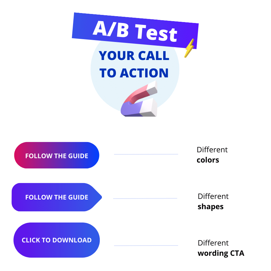
In order to complete this idea, here’s an illustration to show you how to do A/B testing on your CTAs. 💡 Remember that you can test your call-to-action by trying:
- Different colors,
- Different shapes,
- Different wording,
- Different placement,
- Different size, etc.
Conclusion: What is a Call to action?
In conclusion, a call to action is an essential component of any marketing strategy. ⚡
It makes the audience take the desired action and provides them with the necessary information to do so. 😏 A good call to action is concise, clear, and specific.
It should stand out from the rest of the content and be placed strategically on the page. 🖱️ Using different techniques such as urgency and social proof can also increase the effectiveness of a call to action.
Furthermore, a call-to-action is commonly used in marketing to encourage the prospect to take a specific action, whether it be donating to a cause, signing up for a newsletter, or making a change in their behavior (upgrading, etc.) 🏹
It is a powerful tool used by copywriters to motivate their audience to act. 🔥
Whether it is to encourage a purchase, sign up for a newsletter, or share content, a strong call to action can make all the difference in achieving your marketing goals! 🚀
FAQ: Call to action Meaning
Why is call to action important?
As explained earlier, a call to action (CTA) is important in marketing because it encourages the audience to take a specific action. 💪 CTAs are typically written as a short phrase or sentence and are placed in a prominent location to encourage visitors to take action. They can be used in various acquisition channels, such as emails, website landing pages, and social media.
A strong CTA can: ⏬
- Increase conversion rates: ✅ By encouraging potential customers to take a specific action, CTAs can lead to increased sales and revenue.
- Enhance user experience: 🤗 CTAs help visitors navigate through a website and direct them to their desired actions, making it easier to achieve their goals.
- Encourage engagement: 📣 CTAs can increase engagement with your brand by encouraging visitors to take specific actions, such as to follow you on social media or sign up for a newsletter.
Overall, CTAs are an essential element of any successful marketing strategy as they can drive action and help you achieve your business objectives. 🎯
A call-to-action can, and should be, used in all forms of marketing and across all platforms. ✨ Of course, this includes PPC advertisements, but it also refers to other materials like landing pages, websites, blogs, newsletters, and emails. 📨 This occasionally necessitates sticking to a plain-text CTA that may be hyperlinked.
Which call to action button works best?
There’s not a call-to-action button that works for every business. 🤷 But, research has found that the wording of the call-to-action (CTA) button can significantly affect click-through rates.
Here are some effective CTAs that can work well in marketing: 👇
- “Buy now” or “Shop now” – These CTAs create a sense of urgency and encourage immediate action.
- “Learn more” – This CTA can be effective for converting leads who are interested in learning more about a product or service.
- “Sign up” or “Subscribe” – These CTAs work well for email marketing campaigns and gathering leads.
- “Get started” – This CTA can be effective for encouraging potential customers to engage with a product or service.
💡 Ultimately, the effectiveness of a CTA depends on the context and target audience, so it’s essential to test and experiment to find the right CTA that works best for your business.

Perfect! Now you know everything about how to create a powerful Call to action. 🔥


