Do you want to have the best LinkedIn banner and stand out on the network? Then you’re in the right place! 😜 In this article, you’ll find several key points:
- How to build your LinkedIn banner size, cover photo, colors, and logo.
- The key elements to put on your banner to triple your visibility on LinkedIn and find clients!
- How to catch your target’s attention with expert tips.
- The tools that allow you to create a banner quickly without any graphic design skills.
- A video tutorial to guide you from A to Z. 🥰
Follow our tips to create a beautiful profile picture to go with your LinkedIn banner!
Let’s start by laying the groundwork.
LinkedIn banner: useful info
You need a few things if you are going to design the most beautiful LinkedIn cover photo 😍.
- A strategy web marketing strategy is key! You need to ask yourself these questions: Who is your target? What is your message? What are you selling? What are your values?
- Quality visuals (made by your graphic designer or retrieved online. I’ll explain how a little further down).
- A banner creation software: Photoshop or Canva, for example.
- A color palette carefully selected according to your company’s colors.
- The image size of your LinkedIn cover – 1584 × 396 pixels wide (optimal image dimensions for LinkedIn banner).
- The format of the linkedin banner dimensions: 8 MB maximum. (JPEG, GIF, or PNG format).
How to create my LinkedIn cover page according to my target?
It is very simple. 😊 Just put yourself in the shoes of a LinkedIn user you want to attract. In other words, you need to know who you are addressing and how you are going to do it. Your message needs to be clear and understood at a glance. 👀
- Who are you? LinkedIn is a social network. Your LinkedIn profile page will give a first impression of who you are. Users want to see your personality – your “identity” above all. They want to have useful interactions and learn from a human being.
- What is your value proposition? What is your catchphrase? Highlight what you provide to others on the network (expertise, advice). How do you add value to other users?
Write down these two pieces of information on a draft. ✍
This represents your “personal branding” and your values (or your company’s).
- Who does this value proposition benefit? Note your primary target audience – the more detail, the better!
- What’s your target market’s lingo on LinkedIn? Observe them! If they are marketers, what are the keywords that speak to them? If they are recruiters – what skills are they looking for?
Write this information down as well – it will help you draw out the main points of your message. 📩
In order to show you some examples of existing banner templates, I have selected different banners suited to different targets. 🎯
Shall we take a closer look? 🧐
LinkedIn header size in human resources
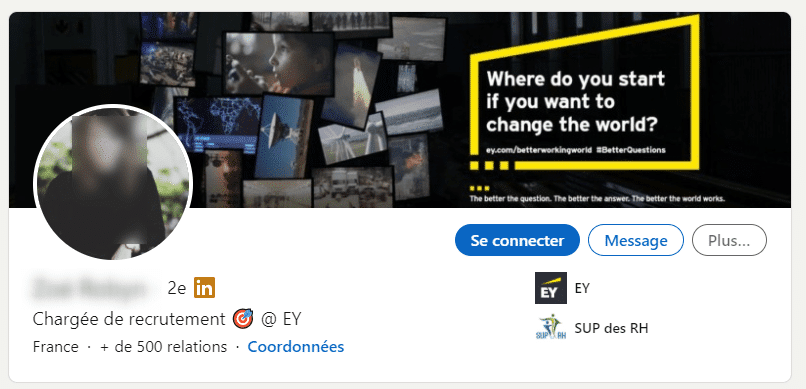
The first example comes from the recruiting brand EY.
Recruiting is very serious business for them, and this is clear by taking one glance at their LinkedIn ready banner. They recruit senior profiles with significant professional experience on their resume – usually, the profiles come with a tie, suit, and leather briefcase. 💼
As a result, the banner totally resembles the values and the target of the company.
It is sober and highlights the ambition of the company – “change the world”. 🌎
You can also see the colors of the company: yellow and black. 🖤
On Plezi’s side, it’s more of an atmosphere 🥳 :
We’re young startups, join us! You’ll be drinking keg beer and your afterworks will be fun parties on the beach.
So you can see, there’s no perfect banner. You’re going to have to tailor it to your target! 🏹
Clearly here, the goal is to recruit junior profiles – developers and other tech profiles. 🤖
It makes sense at first glance, and that’s what I’m going to teach you to do in this article⚡ – attract your target! 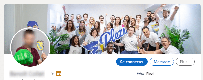
LinkedIn banner dimensions in social media marketing
It’s not just recruitment that deserves its section. I’ll quickly show you another example. ✌️
At Waalaxy, we’ve been banking on the colors of our latest product. 👽
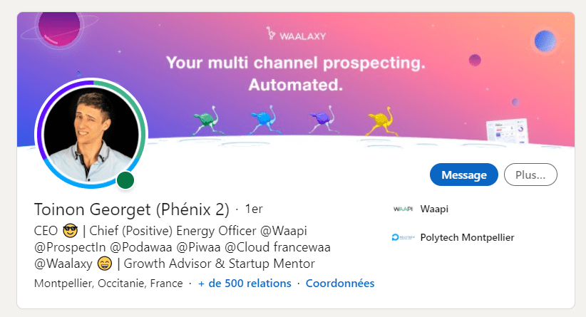
We put forward the graphic charter and the visuals made by our lovely web designer, Pauline. 😘
Also, you can easily see that we have 4 products, which are represented by the colorful ostriches – the best animal totem and logo in the world! 🦄
Also, these colors are dynamic and are in line with the brand colors. 🌈 And with a quick read of the text, you understand what we do and our value proposition – it’s quick and effective.
Original LinkedIn header size
You’re probably wondering: what should I put on my LinkedIn profile banner size? 🧚
Tailor your LinkedIn banner image to your industry. The more personalized your banner is and the better it showcases your work, the more qualified your leads will be.
Remember, the point is to enhance your LinkedIn profile – your brand image. ✨
Stand out from the crowd! Be different. Be yourself 😉
Tip: avoid design templates, seen again and again. 👎
Consider adding a LinkedIn carousel to attract visitors to your LinkedIn personal profile! 🎠
What photo to put in the LinkedIn background banner size?
- First, you should always respect the format. The banner size is defined, and it’s not for nothing – avoid the cropping that will “break” the intended effect of the header image.
- Don’t write a solid wall of text! There are other sections on your LinkedIn account designed for this purpose (about section, article posts). The web banner is for pretty, colorful cover images.
- Don’t put too much information: make it clean and pleasant to look at.
Let’s take the example of a freelancer who wants to stand out from other graphic designers by highlighting his creations. 🤩
There’s a little too much information for my taste. I would suggest a more minimalistic way of showing off his content – a flash banner with less information but all relevant. 👌
Especially if you work in “aesthetics” like designers, for example. You need to show that you have taste. Designers know what to cut out. It’s an essential skill. 💯
Visuals for your LinkedIn banner dimensions
Not everyone has the skills or budget to create great visuals with popular design tools. 🙈
So I found some cool alternatives for you.
You have two options:
- You can ask for a quote from a professional if you want something very specific. You can get an idea if this will be a good option for you by having a look at the company’s social networks.
- Alternatively, you can go on sites specifically designed for non-expert users and easily create a banner yourself.
Let’s look at the second option together. 🤗
There are two types of social media images:
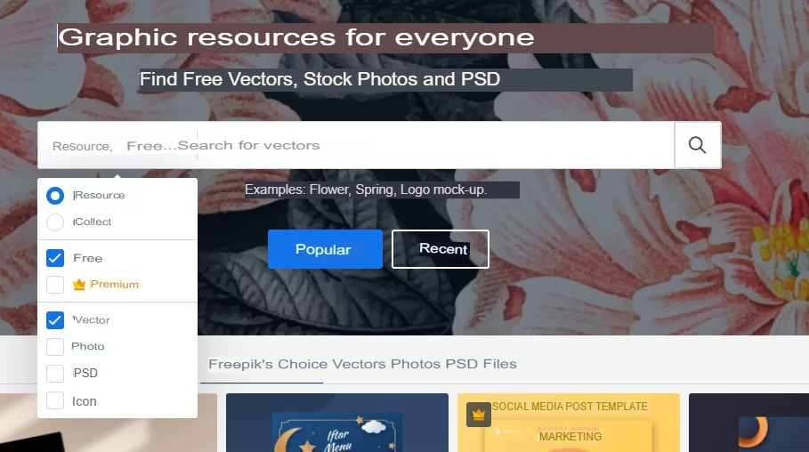
- Vector ones, more of the “virtual drawings” type: you can download some for free on Pixabay or Freepix – which are safe websites. You can find thousands of free vectors there.
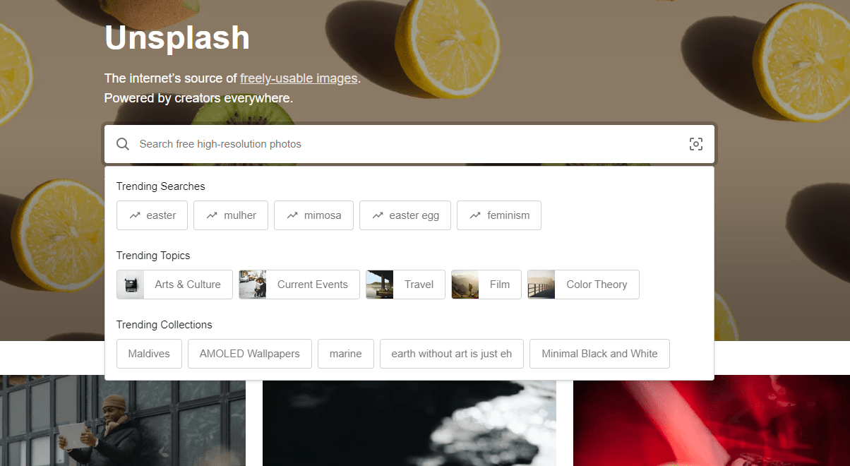
- Professional cover photos: Pixabay and Unsplash offer good quality banner images that you can then resize easily. Just be careful with the copyright.
Essential tools for the layout of your banner
Once you have defined your target and your message, keeping in mind the colors and profile images that transmit the value you want to convey, you are ready! 👏
You will need a design tool to perfect your banner: Photoshop, Illustrator, or Canva, depending on your preferences. 😄
How to make a LinkedIn banner with Canva?
Here at Waalaxy, Canva is the king. 👑 We love using the tool and recommend it, especially if you’re not skilled in graphic design. It’s super easy to use.
It gives you the ideal size for your media image and suggests some visuals (Facebook, Instagram, LinkedIn …). It’s super convenient, so you can’t get lost. ✅
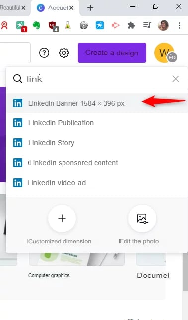
How to add a banner on LinkedIn? 8 steps to follow on Canva
- Go to Canva: Click on “Create a design”.
- Then on “Linkedin header size”.
- Drag and drop the selected images and visuals.
- Add some text (adapted to your graphic charter).
- Then edit the layout and colors and save.
- Go to LinkedIn.
- Click on the background-image, then on “edit”.
- Then simply upload the image that you have just created.
If you want to test this banner maker tool, here’s a direct link to the tutorial. You’ll soon become a pro at creating a LinkedIn banner. 🥸
How to change LinkedIn banner?
Changing your LinkedIn banner is super, super easy! 😅
- Now that you have your cover image, go to your LinkedIn profile. In the banner section, click on the little pen at the top to change it.
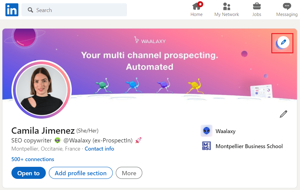
- Next, click “Edit Photo” to upload the profile image you created!
- Finally, make some adjustments if necessary, and click “Use” to update the cover image.
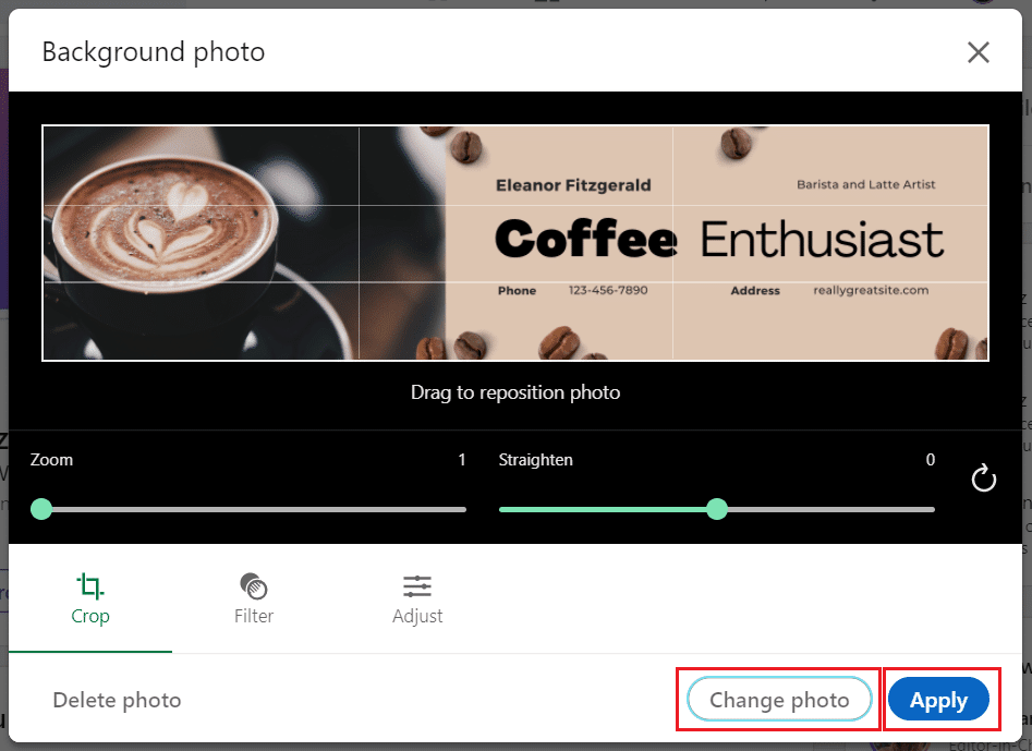
And that’s it. Your new custom banner will be added to your LinkedIn profile banner size. 🌠
Pretty easy, right? 🙏
What’s the LinkedIn header size in 2024?
Here is a cool tool you can use to compress, transform, convert, and manage pixel size – IloveIMAGE. 💕
It is free and very easy to use. You just have to add a photo of your choice and follow the steps. 👇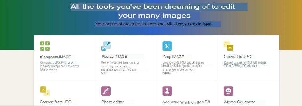
There you go! You now have all the keys in hand to create an amazing cover image! 🗝️
Don’t hesitate to connect with us on LinkedIn so we can see your best LinkedIn banners. 🤠
How about a recap?
In conclusion, LinkedIn banners play an essential role in creating a memorable and professional impression on your profile. They offer a unique opportunity to personalize and enhance your professional identity. 👀
By investing time and effort in designing an attractive and relevant banner, you can strengthen your online presence, attract the attention of recruiters, potential customers, and partners, and thus maximize opportunities for success in the professional world. Don’t underestimate the power of your LinkedIn banner to stand out in today’s digital world. 😇
Frequently asked questions
Did you think we’d just leave you here? No, we have a few more resources to share with you.
How do I get a LinkedIn banner for free?
- Define your target, your message, and your “personal touch”.
- Use the right techniques: clear, uncluttered visuals, easy to understand message at a glance!
- Use the right tools to add an illustration image and make a montage: Pixabay, Canva, IloveIMG.
- Make sure you have the optimal size for your visual – How big? 1584 × 396 pixels.
- Make sure the resolution of the image is top-notch!
Which tools to create my LinkedIn banner?
- To collect royalty-free images: Unsplash, Pixabay, Freepix.
- To adjust the image sizes: IloveIMG.
- To make a collage: Canva.
Now you know how to get started on creating a LinkedIn banner. 🎉
If you want to go further and create an optimal profile, here is how to optimize your LinkedIn profile to attract all the leads. 🚀
What size is a banner post on LinkedIn?
The recommended size for a LinkedIn banner is 1584 x 396 pixels. 😇
And that’s the end of the LinkedIn banner article. See you soon! 👋🏽

