What is a landing page? How does it work? How to create it? How to promote it?
We tell you everything about the importance of an effective conversion page.😉
What is a Landing Page?
What is the purpose of a landing page?
Landing pages are often used for online marketing campaigns or advertisements. Their purpose is to reassure users about a product or a company and to make them buy thanks to CTAs (calls to action).

The effectiveness of the landing pages is measured by the conversion rate, i.e. the number of visitors who take a desired action on the page, such as filling out a registration form or buying a product.
Where are the landing pages located?
Landing pages are usually located on a website or on a separate web page and are accessible via a link or a specific URL.
For example, here, the URL of the conversion page is unique, but on the page you can find links to the blog and the tool you are selling. In the same way, the blog also redirects to the landing to facilitate conversion.

How to create a Landing Page?
You can create this page using page creation tools such as :
| Create a destination page with : | 🟢 | 🔴 |
| Web page builders (Elementor type from WordPress), | Very easy to use, with templates already filled. | It is difficult to customize them. |
| Marketing automation platforms. | Often offers associated marketing solutions; cookies, mailing. | Less easy than WordPress. |
| By hand coding the page if you have a dedicated developer. | Totally customizable. | Must have a developer, it is more expensive. |
There are also many predefined templates that you can customize to create an effective landing for your business.
For example, here on Thrive
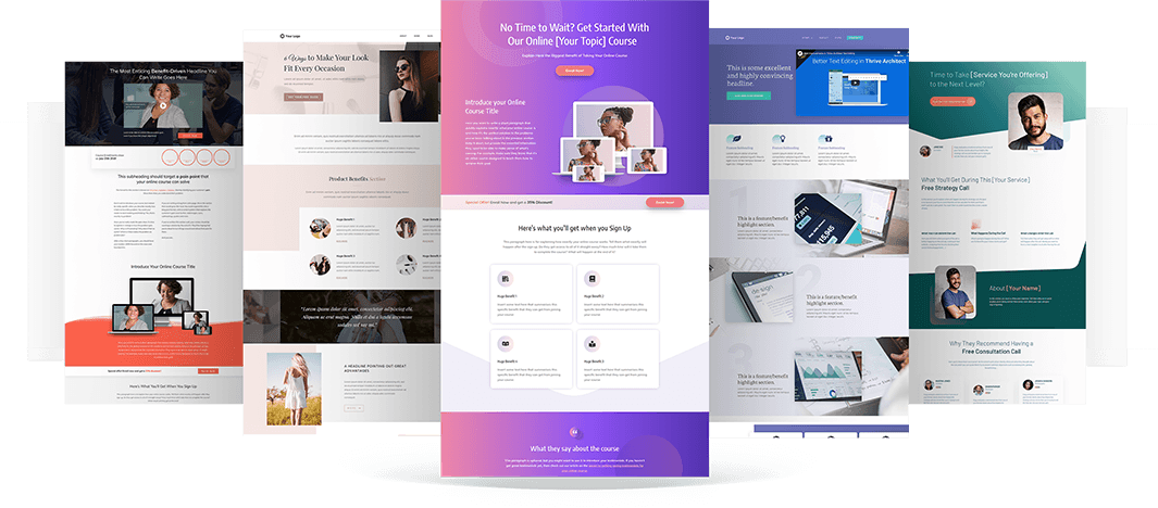
So to conclude: It is not necessary to have programming skills to create a conversion page, but it can help if you want to create a custom and advanced page.
How to make a Good Landing Page?
An ideal conversion page contains the following elements: A catchy title, a value proposition, a video or image presentation, a CTA and testimonials. To go further, we can optimize the page in terms of SEO and ensure a clear design.
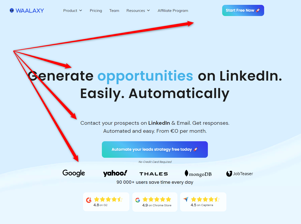
We’ll break it all down together in the rest of the article! 😉
1. A clear and catchy title
The title must be explicit and show immediately what the page proposes and therefore the tool/service you are selling. Be clear and concise.

2. Value Proposition Message
It should clearly explain what the visitor can expect from the offer and start to see the benefits they can get from it. Use words like “easy” “effective” “fast” .

3. Image or video presentation
An image or video to present the offer can help make it more appealing and easier to understand. Consider airing out your landing and adding images a bit throughout your prospect’s navigation.
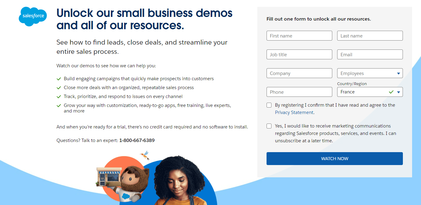
4. Conversion form
In some cases, especially if there are intermediate actions between the landing and the purchase (making a demo, booking an appointment), it will be necessary to insert an automated form.
This form allows you to have a list of hot prospects directly, you can then add them to a transactional mailbox, in a connected contact calendar.
5. Clear call to action (CTA) button
The CTA button must be visible and encourage visitors to act. There should be several on your destination page, in the top right corner of the screen, close to the title and close to the customer testimonials, another in the footer for example.

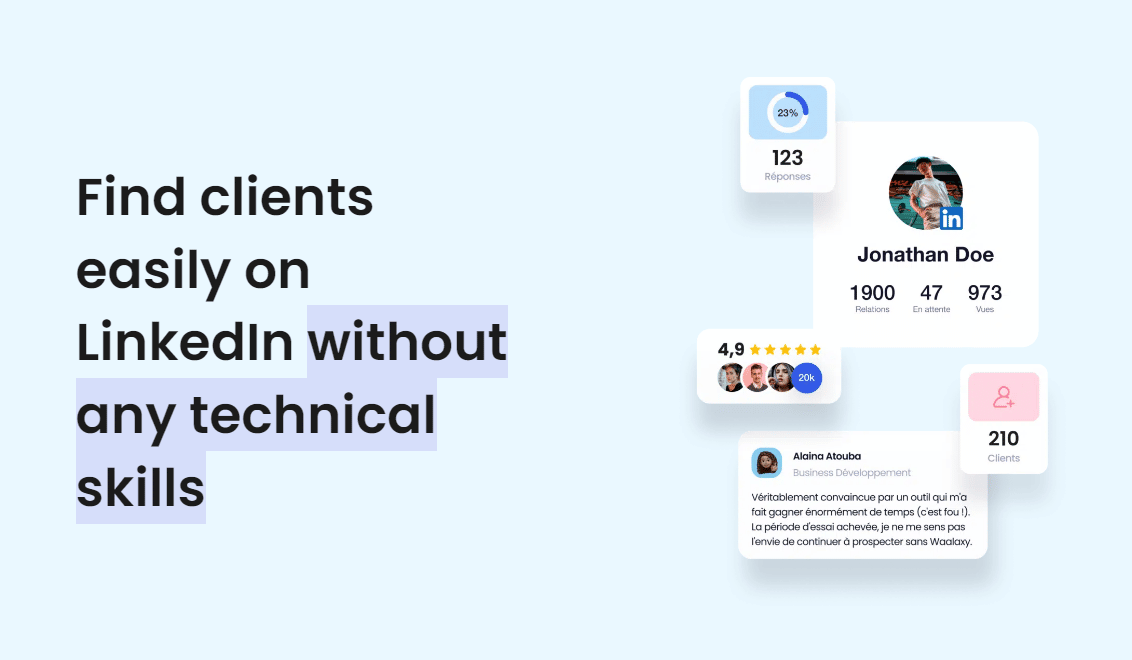
6. Social proof (testimonials)
Testimonials from satisfied customers, brand logos and statistics can help build trust in the value proposition. You can also add testimonials in video format.

7. Minimal navigation:
Landing pages should be simple and minimize distractions by limiting navigation. You want your target to stay on your landing page, right?
💡 So avoid any distractions, have a custom menu bar, with very few navigation options.
8. Search engine optimization (SEO):
Landing pages should be optimized for search engines, using relevant keywords and ensuring a consistent page structure. (more on this later!)
By including these key elements, you can create a compelling and effective conversion page that maximizes conversions for your business.
What are the key Components of a Landing Page?
So, here’s a quick summary of what we’ve just explained.
To maximize conversion on a landing page, it is important to include the following elements:
- 🎯 Clear purpose.
- ☑️ A strong call to action.
- ✍️ Relevant content.
- 💌 Attractive design.
- 🤝 Social proof.
- 🤳 Optimization for mobile devices.
- 📄 Conversion form (optional).
- 📚 Natural SEO.
By including these elements, you can maximize conversion on your landing page and achieve your online marketing goals.
But then, even though we often talk about natural SEO to optimize a landing, this word means everything and nothing to some, I’m zooming in on the importance of this. 👀
How to Optimize a Landing Page?
To promote the natural referencing of a landing page, it is important to respect the following elements 👇:
Examples of Landing Pages that Convert
There’s nothing better than working with examples of the best landings you can find on the net! Here are some of the most successful landings…
Dropbox Example of Landing Page
An example of a company with a great landing page is Dropbox. Dropbox’s landing page is simple, clear and conversion-focused.
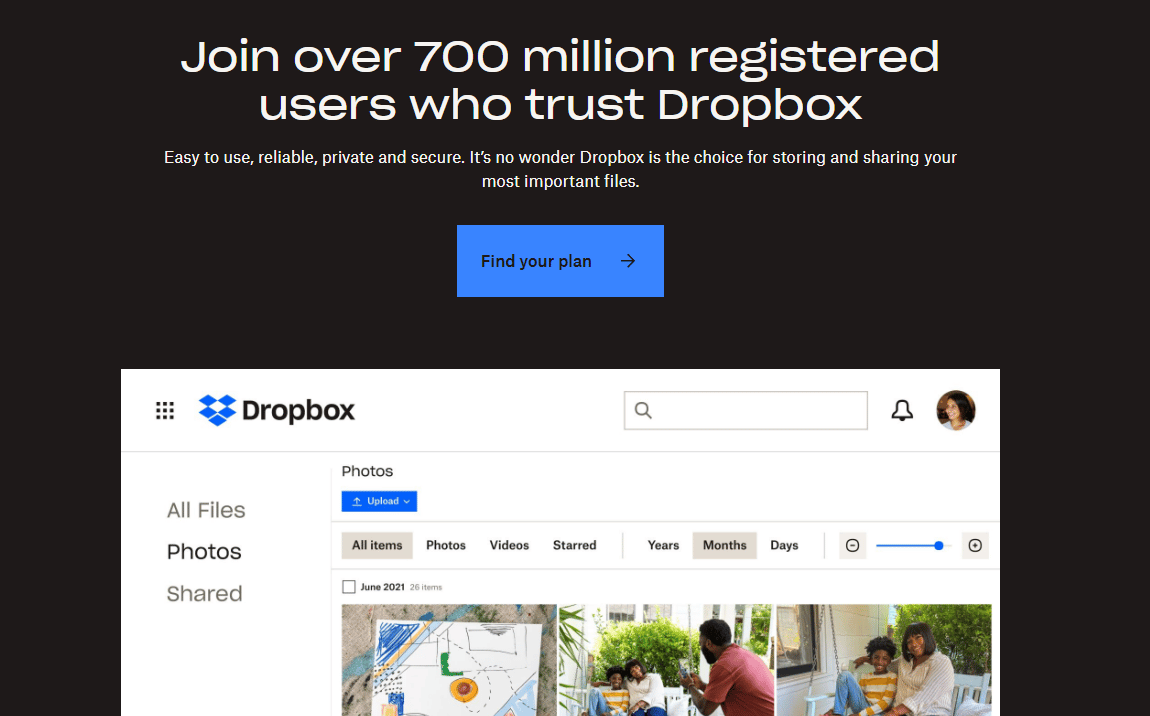
You will find :
🟢 A clear and concise header that clearly defines what Dropbox is and what it does.
🟢 A prominent call-to-action button that encourages visitors to sign up.
🟢 An engaging visual presentation of Dropbox’s solution, with images and illustrations to reinforce key messages.
🟢 Clear, concise information about Dropbox’s features to reassure prospects and help them understand how the solution can help them.
🟢 Real customer testimonials to reinforce the credibility of the solution.
HubSpot Example of Landing Page
HubSpot’s landing page is highly visual and engaging, with a clear value proposition and optimal usability. In 2021, HubSpot‘s average conversion rate was around 18%.
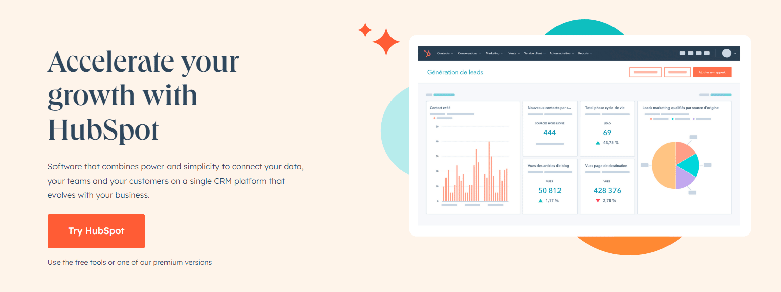
HubSpot’s landing page is considered successful for several reasons:
🟢 Clear value propositions: The landing page highlights HubSpot’s key benefits to users, giving them a clear understanding of what they can expect from the platform.
🟢 Visual design: The page is well-designed, with effective use of space, images, and colors to grab visitors’ attention.
🟢 Easy navigation : The page is easy to navigate and allows visitors to quickly find the information they are looking for.
🟢 Well-placed calls to action (CTAs): Call-to-action buttons are well-placed on the page, prompting visitors to take action.
🟢 Optimized for mobile: The landing page is optimized for mobile devices, which is essential as more and more people access the internet via mobile devices.
Waalaxy Example of a Landing Page
You’ve been shown several parts of the Waalaxy landing page throughout this article, if you’re curious and want to see the entire Waalaxy landing page, the button is right there 👇 :
[maxbutton id=”89″ url=”https://chrome.google.com/webstore/detail/waalaxy-1-linkedin-automa/hlkiignknimkfafapmgpbnbnmkajgljh?hl=fr” text=”See Waalaxy landing page 👀” ]
Find the right Landing Page Builder
I’ve noted the pros and cons; low budgets, and the most effective tools, so there’s something for everyone. 🤗
Leadpages for Landing Page
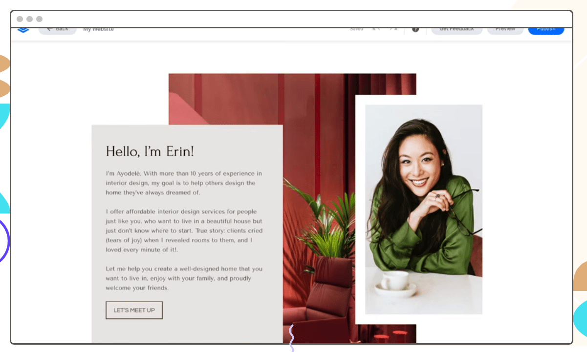
Leadpages is an online tool for creating effective landing pages, with a wide variety of templates and features to help you convert visitors into customers.
It’s easy to use and allows you to customize your page with just a few clicks 😉
| 🟢 | 🔴 |
| Variety of templates. |
Customization limitations on the low-end version.
|
| Easy to use page builder. |
Limited functionality on low-end version.
|
| Easy customization. | Limited support. |
| Advanced features. | Expensive premium version. |
Unbounce for Landing Page
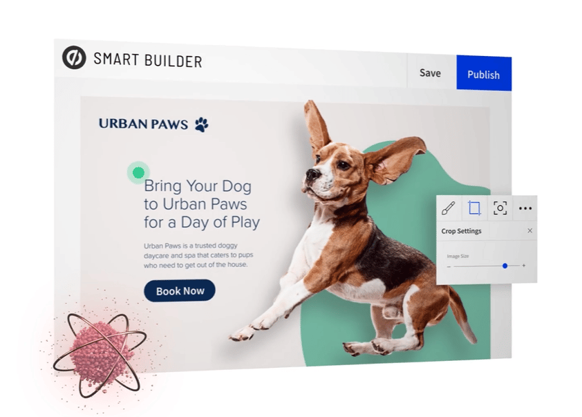
Unbounce is another online tool for creating effective landing pages, with an intuitive visual page builder to help you create a professional page in no time.
It also offers advanced features for businesses, such as A/B optimization and integration with marketing automation tools. (And we love that!) 💗
| 🟢 | 🔴 |
| Visual page builder. | Expensive premium version. |
| Variety of templates. | Limitations of customization without coding. |
| Advanced features. | Limited features in low-end packages. |
| Easy customization. | Limited support. |
Instapage for Landing Page
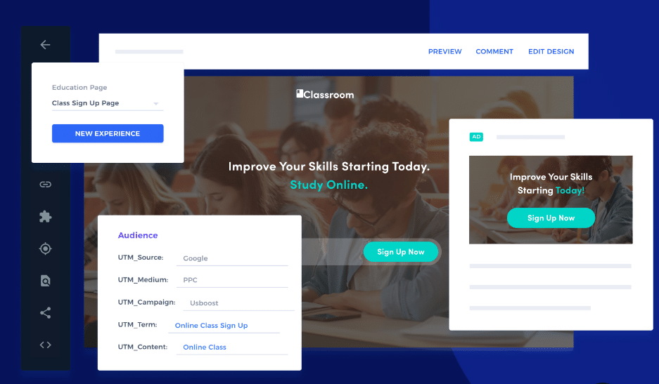
Instapage is a landing page builder designed to help businesses optimize their conversion rate. It offers features to improve user experience and maximize conversions.😉
| 🟢 | 🔴 |
| Easy to use page builder. | Cost. |
| Advanced customization. | Customization limitations in low-end packages. |
| Integration with marketing automation tools. | Limited functionality in low-end packages. |
| Advanced analytics. | Difficult to learn. |
How to Promote a Landing Page?
AdWords or Google Ads for advertisement
You can use Google Ads (AdWords) to promote your landing page by creating an online ad campaign that targets keywords relevant to your business.
By using targeted ads and special offers, you can attract qualified visitors to your landing page and increase conversions. 🎯
Marketing automation
You can use marketing automation to automate repetitive tasks, such as follow-up emails, conversion forms and landing pages, to maximize the effectiveness of your online marketing strategy.
You can use marketing automation scenarios to target visitors based on their behavior and conversion history, and prompt them to take an action on your landing page. 🤑
Case study of email marketing automation to promote a landing page:
Let’s say you have a business that sells fitness products online 💪, and you’ve created a landing page to promote a special offer on purchasing a complete fitness kit. 🎁
You can use marketing automation to promote your landing page in the following ways:
Using this marketing automation scenario, you can effectively promote your landing page to a target audience and maximize conversions.
Conclusion & FAQ: Landing Page
What is a landing page in the context of inbound marketing?
A conversion page is a page that aims to convert visitors into leads or potential customers by using a clear and effective call to action.
In inbound marketing, landing pages are often used as the end point for various lead generation campaigns, such as downloading an e-book or filling out a form. 📖
How does a conversion tunnel work for a landing page?
A conversion tunnel is a process that guides visitors through different steps to convert into leads or customers.
A conversion tunnel for a landing page can include additional pages such as thank you pages, confirmation pages, etc. 🛝
This page is usually the last step in the tunnel and should be designed to maximize conversion using elements such as an effective call to action, compelling layout, and personalization tailored to the target audience.
Why is it important to choose a responsive landing page to generate leads?
Choosing a responsive lead capture page is important for lead generation because it allows you to adapt to all types of devices, such as computers, tablets and cell phones. 🤳
You provide an optimal user experience for visitors, which can facilitate conversion and increase lead generation. 🤑
How can calls to action increase conversion on a landing page?
Calls to action (CTAs) are buttons or links that prompt visitors to take action, such as filling out a form or downloading an e-book.
By using clear, eye-catching CTAs, you can entice visitors to convert into leads or potential customers. Also, by testing different types of CTAs and measuring their performance, you can determine what works best for your target audience and thus optimize conversion on your page. 🎯
Can you create a landing page without a website?
Yes. ✅ Just by using a landing builder tool: Many lead capture page builders, such as Leadpages, Unbounce, Instapage, and more, offer the ability to create pages without the need for a website.
These tools provide templates, drag-and-drop editors, and hosting for your pages. 😉
How can lay out and personalization help conversion on a landing page?
The layout and personalization of the page can play an important role in facilitating conversion. By using a consistent and well-organized layout, you can guide visitors to the call to action.
Additionally, by personalizing the conversion page based on your target audience, you can create a more relevant experience and ensure that you’re sending the right message, to the right person. 💌
And there you have it, you know everything about creating your landing page, launching your digital strategy, and boosting your conversions!


