What is the real influence of colors in marketing? What are they and what purpose do they serve? These are the 3 questions we will be answering throughout this article.
We already know, thanks to eye tracking, that our eyes are attracted to advertising; typology, shapes, colors… are the allies of good marketing communication.
When you’re making a purchasing decision, it’s highly likely that you don’t realize the extent to which colors play an essential role in your decision.
Whether it’s the logo, the website, the application, or even the product packaging, the colors you see send subtle messages. As an advertiser, your choice of colors influences the way people perceive your brand. Reflection’ is how consumers associate with your branding.
So how do colors become powerful tools for interacting with your audience, and which colors should you choose?
Let’s find out together! 🫶
What are marketing colors?
When we talk about the influence of colors in marketing, we enter the captivating field of psychology. (And it’s my favorite area) 👀 Each color evokes specific emotions, memories, and associations.
But it’s not the only emblematic color, and you’ll probably be surprised to discover just how much you were influenced by certain colors without knowing it. 😱
That’s why choosing your brand’s color palette is much more than just an aesthetic issue.
Colors all have meanings, but beware, they are not universal.
What corresponds to one country doesn’t necessarily correspond to all customs, and the examples I’ve given you here generally work for the United States and Europe.
That said, colors are filtered through the prism of the individual, considering factors such as past experiences, age, gender, cultural differences, and even the moment of exposure. What we’re talking about today is a global generality, so a color might inspire you differently than what you’re about to read, probably because of a personal experience. 😉
Quick answers on marketing colors:
- What color is positive energy? Yellow. Because it’s sunny, fun, and happy.
- What colors promote trust? Blue. It’s reliable, calming, and reassuring.
- What color makes people happy? Yellow, orange or light pink. Because it’s warm and welcoming.
- What color catches the eye first? Of course, Red.
- What color represents strength? Red or Brown, for stability.
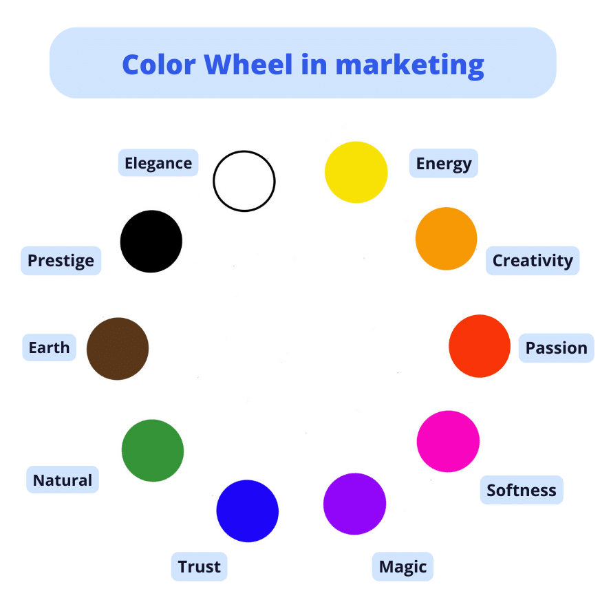
What to learn more? Here you can find the color wheel of marketing. 😉
Red marketing color
🔴 Red, the color of the heart and passion.
What is the most eye-catching color? It’s Red! Red has a major presence in the world of marketing and branding. It evokes not only love and life but also energy and urgency. Tech companies use red to attract attention and inspire action.
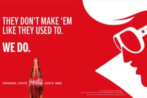
An emblematic example of the use of red in marketing is Coca-Cola.
Coca-Cola’s bright red logo is a classic example of how this color can influence consumer perceptions and behavior. Red stimulates appetite, action, and vitality. The brand was able to create a strong emotional connection with its audience through this strategic use of red in its visual identity.
It was a risky and daring move, as red also represents danger and warning, and is widely used in prevention campaigns.
Types of red
| 🔴 Shades of red | 🔴 Emotional association | 🔴 Examples of use in marketing |
| Bright Red | Passion, Energy, Urgency | Call-to-action, promotional ads |
| Blood Red | Love, Intensity, Dramatic | Romantic products, jewelry |
| Bordeaux Red | Elegance, Refinement, Prestige | Top-of-the-range products, luxury brands |
| Raspberry Red | Emotion, Sensitivity, Expressiveness | Artistic products, sensory experiences |
Marketing blue
🔵 Blue, for calm and confidence.
Among the most popular colors in marketing, blue stands out. Linked to the immensity of the sea and the vast expanse of the sky, blue naturally evokes feelings of calm, serenity, and confidence. High-tech companies often opt for blue to evoke reliability and security.
Giants like Facebook and LinkedIn use the color to reinforce their image of trust and connection.

Understanding shades of blue
| 🔵 Shades of Blue | 🔵 Emotional Association | 🔵 Examples of Use in Marketing |
| Sky Blue | Serenity, Clarity, Open-mindedness | Companies focused on mental health |
| Cobalt Blue | Depth, Stability, Confidence | Financial companies, professional services |
| Navy Blue | Classicism, Elegance, Authority | Luxury brands, high-end products |
| Azure Blue | Freedom, Pleasure, Inspirational | Travel brands, recreational products |
| Petrol Blue | Modernity, Technology, Refinement | Tech companies, innovative products |
Yellow marketing color
🟡 Yellow, associated with sunshine and light, embodies positivity and energy.
Companies that choose yellow typically target a young, enthusiastic audience.
Brands such as Lidl and Snapchat use yellow to project an image of dynamism and/or affordability.
Types of yellow and their marketing significance
| 🟡 Shades of Yellow | 🟡 Emotional Association | 🟡 Examples of Marketing Use |
| Bright Yellow | Energy, Positivity, Attention | Calls to action, promotions |
| Pale Yellow | Sweetness, Joy, Innocence | Children’s products, sunny events |
| Mustard Yellow | Warmth, Friendliness, Originality | Handcrafted products, unique design |
| Gold Yellow | Luxury, Prestige, Excellence | Top-of-the-range brands, premium products |
| Lemon Yellow | Freshness, Vitality, Innovation | Technological products, modern brands |
Green in marketing
🟢 Green: harmony with nature.
Closely associated with nature and health, green is a color that embodies freshness, vitality, and well-being. In marketing, green is typically adopted by companies that are eco-responsible, sustainable, or that promote natural and organic products. This hue evokes a deep connection with nature and conjures up notions of growth, renewal, and balance.
Yves Rocher uses green to convey their values of harmony. As a natural skincare and beauty brand, the company uses green to reinforce its commitment to nature and biodiversity.

Each shade of green has its own emotional connotations
| 🟢 Shade of Green | 🟢 Emotional Association | 🟢 Examples of Marketing Use |
| Apple Green | Freshness, Vitality, Youth |
Energizing products, children’s brands
|
| Olive Green | Nature, Authenticity, Sustainability | Eco-responsible brands, organic products |
| Mint Green | Soothing, Purity, Renovation | Relaxation products, Zen spaces |
| Emerald Green | Luxury | Top-of-the-range products |
| Lemon Green | Enthusiasm, Energy, Innovation | Innovative products |
| Forest Green | Harmony, Growth, Connection to nature | Sustainable products, Natural brands |
| Turquoise Green | Freshness, Creativity, Open-mindedness | Innovative brands, modern designs |
Orange in marketing
🟠 Orange: creativity and enthusiasm.
Orange, a bright, warm color, evokes energy, creativity, and enthusiasm. In the context of marketing for business, orange is often used to capture attention and convey a feeling of optimism. Using orange can be used to create visual communication and arouse consumer interest.
Orange has the distinction of being a natural eye-catcher. Its striking character makes it an excellent choice for brands wishing to stand out in a competitive environment.
Brands such as Orange (well, that was an easy one 😂) and Zalando use orange to reflect their innovative and inspiring spirit.
Shades of Orange
| 🟠 Shades of Orange | 🟠 Emotional association | 🟠 Examples of marketing use |
| Bright Orange | Energy, Enthusiasm, Creativity | Children’s products, festive events, dynamic brands |
| Blood Orange | Warmth, conviviality, | Food products, catering |
| Mandarin Orange | Freshness, Joy, Vitality |
Refreshing drinks, summer brands
|
| Coral Orange | Innovation, Modernity |
Technology campaigns, product launches
|
| Peach Orange | Softness, Accessibility, Friendliness |
Personal care products, casual fashion
|
Brown in color marketing
🟤 The color brown is often associated with elements such as stability, warmth and earthiness.
In marketing, the use of the color brown can evoke feelings of comfort, authenticity, and tradition. Companies looking to project an image of reliability, naturalness, and durability could use shades of brown in their branding.
The iconic UPS logo features a brown shield with the white letters “UPS” at its center. The color brown in this context evokes ideas of reliability, trust, and tradition, which fits perfectly with a delivery company looking to show that it can be trusted to transport packages safely.
The choice of brown in the UPS logo also connotes robustness and efficiency, which is in line with the logistics and delivery sector.

| 🟤 Shade of Brown | 🟤 Emotional Association | 🟤 Examples of Marketing Use |
| Chocolate brown | Luxury, Elegance, Sophistication | Jewelry, perfume, and car brands |
| Coffee brown | Tradition, Authenticity, Simplicity |
Brands of natural, local and artisanal products
|
| Hazelnut brown | Comfort, Warmth, Simplicity |
Brands of products for the home, skin care and casual wear
|
| Fawn Brown | Nature, Ecology, Authenticity |
Brands of natural products, local produce and handicrafts
|
| Toffee brown | Luxury, Radiance, Sophistication | Jewelry, perfume, and car brands |
| Honey brown | Nature, Ecology, Softness |
Brands of natural products, local produce and handicrafts
|
Pink in marketing
🌸 Pink: femininity and softness.
Pink evokes softness, benevolence, and originality. Often associated with childhood and femininity, it is used to create a warm and engaging atmosphere.
Two emblematic examples of companies incorporating pink into their branding are Etam and Lancôme. These brands, both in the beauty and fashion sectors, use pink to communicate specific emotions and create a positive influence on their targets.
Etam, by incorporating shades of pink into its logo and designs, appeals to feminine sensibilities and the notion of benevolence, offering a shopping experience that emphasizes femininity and comfort.
On the other hand, Lancôme associates pink with sophistication and timeless femininity, harmonizing with its upmarket positioning in the beauty industry.
Shades of pink in marketing
| 🌸 Nuance de Rose | 🌸 Emotional association | 🌸 Examples of use in marketing |
| Pale Pink | Sweetness, Innocence, Romanticism | Baby products, wedding events |
| Bright Pink | Energy, Vitality, Peps, Teenage girls | Advertising for dynamic products |
| Powder Pink | Elegance, Refinement, Subtlety | High-end fashion products |
| Fuchsia | Boldness, Self-confidence, Modernity | “Avant-garde” fashion campaigns |
| Salmon Pink | Warmth, Friendliness, Conviviality, | Coworking spaces, social events |
| Mauve Pink | Mystery, Creativity, Introspection | Artistic products, innovative brands |
| Champagne Pink | Luxury, Celebration, Prestige | Bottles of champagne, VIP events |
| Coral Pink | Positive Energy, Joy, Enthusiasm | Fitness products, advertising |
| Dusty Pink | Retro, Nostalgia, Charm | Vintage products, retro design |
| Pastel Pink | Softness, Serenity, Calm | Spas, wellness products |
Violet in marketing
🟣 Violet: dreams and mystery.
Purple, balanced between red and blue, inspires dreams and mystery. 🔮
Purple also has digital and youthful connotations. Because of its frequent presence in digital interfaces and online graphics, it is often associated with technology and digital culture. This color speaks to generations that have grown up with technology and are familiar with virtual environments.
Two examples of companies using purple in their branding are Twitch and Yahoo! Twitch, a live-streaming platform focused on video games and creative content, incorporates purple into its logo and design to capture the attention of gamers and creators while reflecting the dynamic and innovative spirit of the platform.
Yahoo!, the former icon of the Internet, uses purple to spark curiosity and evoke online exploration, while recalling its history and association with the digital world.

Shades of Violet in marketing
| 🟣 Shades of Violet | 🟣Emotional association | 🟣 Examples of Use in Marketing |
| Lavender Violet | Romanticism, Serenity, Softness | Wellness products, cosmetics |
| Dark Violet | Elegance, Refinement, Prestige | Top-of-the-range brands, luxury products |
| Electric Violet | Innovation, Originality, Energy | Campaigns for technology start-ups |
| Pastel Violet | Subtlety, Reverie, Intuition | Fragrance campaigns, artistic products |
| Purple Violet | Creativity, Mystery, Imagination | Artistic and creative platforms |
| Powdery Violet | Delicacy, Sensitivity, Romanticism | Fashion and decoration products |
| Night Violet Mystery | Dark Elegance | Sophistication, luxury brands |
White in marketing
⚪️ White is synonymous with simplicity and elegance.
White is a symbol of purity and innocence, but also of natural elegance. Take the iconic example of wedding dresses. 👀 It’s a neutral color that blends well with other colors, making it a popular choice for companies that want to project an image of modernity and sophistication.
In the tech sector, white is typically used to create an impression of simplicity and clarity. Tech companies often use white for their logos, websites, and advertising. White is also popular in architecture and office interior design, as it creates an impression of space and tranquility.
Nike, for example, combines white with black to convey prestige and elegance.
Shades of white in marketing
| ⚪️ Shades of white | ⚪️ Emotional association | ⚪️ Examples of use in marketing |
| Snow White | Purity, Simplicity, Clarity | Technological products, streamlined packaging |
| Off White | Tradition, Elegance, Softness | Top-of-the-range products, classic styles |
| Ivory White | Refinement, Timelessness | Luxury brands |
| Linen White | Natural, Authentic, Durable | Environmentally friendly products |
| Cream White | Comfort, Softness, Accessibility | Products for the home, skincare |
| Pearl White | Prestige, Luxury, Elegance | High-end watches, jewelry |
Black in marketing
⚫️ Black: Timeless color of prestige.
Evoking elegance and prestige, black is used by tech companies to embody sophistication and longevity. It is typically used in combination with other colors to create contrast. Brands such as Dior and Chanel use black to project an image of power and prestige and target more affluent consumers.

Shades of black in marketing
| ⚫️ Shades of Black | ⚫️ Emotional Association | ⚫️ Examples of use in marketing |
| Deep Black | Elegance, Power, Sophistication | Luxury, fashion, and technology brands |
| Charcoal Black | Power, Strength, Energy | Car, sports, and technology brands |
| Jet black | Elegance, Luxury, Sophistication | Jewelry, perfume, and car brands |
| Ebony black | Classic, Tradition, Elegance |
Fashion, luxury, and beauty brands
|
| Slate Black | Sobriety, Simplicity, Modernity |
Technology, fashion, and luxury brands
|
| Anthracite Black | Modernity, Energy, Power | Technology, sport, and car brands |

Conclusion on marketing colors
Colors play an important role in marketing. 🌸🌼
They can be used to attract attention, create emotions, and memorize a brand.
Here are some tips for using colors in marketing:
- 🕵️♀️ Do your research. Before choosing colors for your brand, take the time to research color psychology. (You should already find as much information as possible in this article!)
- 👩🏫 Be consistent. Once you’ve chosen your colors, use them consistently on all your communication materials, don’t create hundreds of variations.
- 👩🎨 Be creative. Don’t be afraid to experiment with different colors and combinations. You can use contrasting colors to create a strong visual impact, or softer colors to create a more relaxing atmosphere, depending on your products and branding.
By understanding the impact of color on human psychology, companies can create a consistent and memorable brand image that resonates with their target audience.
FAQ of marketing colors
What Color is best for marketing?
As you can see, the choice of colors is much more than a question of personal preference. 🤷 It’s a strategic decision that influences how consumers perceive your company. Each color tells a story, evokes emotions, and attracts a specific audience.
What is ‘color coding’ in marketing?
Respecting a color code in marketing means using the same colors consistently across all of a brand’s communication media. This creates a strong, recognizable visual identity and instills a sense of trust and familiarity with consumers.
If your brand continually changes logo or color, you cannot create a sense of habit and reference for the consumer, and so you risk losing customers easily. 🙈
As we saw above, the Coca-Cola brand uses red and white on all its products and communication media. Red is a warm, stimulating color that is often associated with energy and excitement. White is a neutral color that enhances the red. The consistent use of these two colors has helped to make Coca-Cola a recognizable and iconic brand.
How does marketing color psychology work?
Marketing color psychology is the study of the impact of colors on the emotions and behavior of consumers. Each color has its meaning and psychological impact.
For example, blue is frequently associated with confidence, peace, and security. This is why it is regularly used by banks, insurance companies, and technology firms.
So there you have it, you now know all about marketing colors, I hope you had a good time reading this article and were able to find all the information you needed. 🫶