Created in 2002 and launched the following year, LinkedIn had a very unique visual identity in its early days.
Want to see the evolution and download the LinkedIn logo in different formats? You’ve come to the right place! Discover the logo’s history and download different versions in PNG, SVG or JPG for use in your projects.
Get the current LinkedIn logo in high quality and give your content a professional touch! 🚀
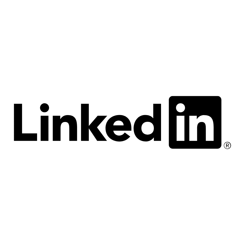
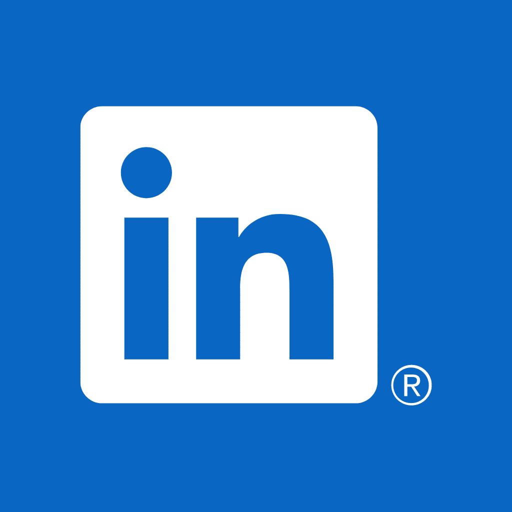
Official LinkedIn logos
Since its creation, LinkedIn has evolved a lot and, with it, its logo. Here are all the current and official logo LinkedIn free download. Simply save the logo of your choice by right-clicking on the LinkedIn image. 👇
In PNG format


SVG format


JPG format

Original LinkedIn logos
Tired of seeing the same LinkedIn logos over and over? 🥲
Here’s a selection of different LinkedIn logo color, format (PNG, SVG, PSD…) and styles (3D, colored, drawn…). These can be used to add a touch of creativity to your projects. 🎨
LinkedIn Colors logos
PNG format


SVG format


JPG format


Logos in different shapes
PNG format


SVG format


JPG format


Other LinkedIn logos
PNG format


In SVG format


JPG format


GIF format

The history of the LinkedIn logo
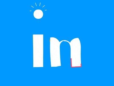
In 2002, Reid Hoffman, Konstantin Guericke, Jean-Luc Vaillant, Allen Blue and Eric Ly had an idea: to create a professional site. They called the site LinkedIn, and it was born in Mountain View, California. ☀️
LinkedIn was born of a simple idea: to help people find the expertise they need, find a job, make professional contacts and form business partnerships. This idea quickly won over the world, and today over a billion people from 200 different countries are registered on the platform, covering more than 400 business sectors. 👷
The adventure officially began at the end of 2002, with the launch of the logo and the company, but it was in the spring of 2003 that the service really took off.
In 2011, LinkedIn took a major step forward by going public, listed on the New York Stock Exchange. Then, in January 2017, Microsoft acquired LinkedIn, marking a new era for the platform. Each stage of this evolution is symbolized by its iconic logo. 🌱
LinkedIn Logo from 2003 to 2011
The logo consists of two keywords « Linked » = « connected » and « In » = « in ». 🤝
It’s no coincidence that LinkedIn has opted for this name, based on the idea of relationship levels. The idea is to use the links you have with your network of connections to build and enrich your professional .
Thanks to this network, you can forge new partnerships based on professional affinities. 💼
From LinkedIn’s opening in 2003, the network displays the word « Linked » in black and the word « In » in white. But there’s still that blue square background we’re still familiar with today. A font with straight letters. LinkedIn wanted to assert its seriousness and notoriety. 🤓
The original was designed by graphic artists. It’s simple, yet practical, which helps set a serious tone. The word « LinkedIn » is written in the Myriad Pro font: the light, semi-gray font is the first half of the image. 🌓
With the exception of the first, all letters are lowercase, black and sans-serif to simplify reading. The dot above the « i » and the uppercase « L » have the same height, and the ends of the letters « k » and « d » have the same length and width. 📐
The « In » element comes last. It’s in a blue square with rounded sides. It stands out and stands out against a blue background.
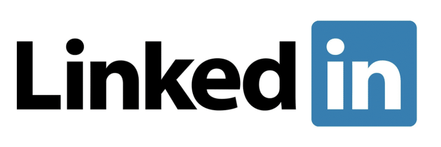
The LinkedIn logo from 2011 to 2019
After eight years, the designers decided to refresh the visual identity of the LinkedIn logo. The reason? The website was listed on the New York Stock Exchange. To mark the occasion, the designers enlarged the letters, by just a few millimeters, to make the logotype more visible, even if the changes aren’t immediately obvious. 👁️
They also gave character to « e » by refining its lower part and adding a little curvature. 🌙
The LinkedIn logo has a distinctive color, referred to as “LinkedIn blue”. 🔵
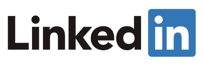
The LinkedIn logo from 2019 to the present day
After two years under Microsoft’s management, the network got a new logo. Adjustments have been made to the color palette, which is why the sign appears « monochromatic » yet contrasting. 🌘
The color blue is present throughout the logo, resulting in blue text on a white background. The second part of the logo remains unchanged. 🏅
So 2019 saw the birth of the LinkedIn logo as we know it today. The choice of blue throughout the logo is designed to inspire confidence. 💯
The LinkedIn logo is « simplified », using only this color. This is a trend found on several other sites.
One thinks of the logotypes of the Google suite (Maps, Hangout, Gmail…), unified and simplified to stick to the same graphic charter and reaffirm their visual identity. 👌

LinkedIn logo font
You’re probably wondering what typeface is used in the LinkedIn logo?
LinkedIn font name is a variant of Myriad Pro, a font that can be purchased online.💸
Myriad Pro-Light or Myriad Pro-Semibold are two fonts that can be used in the LinkedIn logo. They look similar. But they do have their little differences, such as the spaces between the letters or the shape of the curves. Both fonts are sans serif with geometric letterforms. Paul D. Hunt, a topographer, created both variants. 🌌
If you’re a creative soul, you may need the font for a particular model or project. This one adapts to all media. 😎
If you’d like to know more about the history of this typeface, Myriad is a sans-serif font created by Robert Slimbach and Carol Twombly for Adobe Systems. 👩🏻🎨
Logo LinkedIn color codes
The color palette of the LinkedIn logo is simple. The three distinct hues that are blue, white and black. ⚫
➡️ The LinkedIn blue color code used for the font and square of the « mini-logo » is:
⦁ HEX: #0077B5.
⦁ RGB: (10, 102, 194).
⦁ CMYK: (87, 62, 0, 0).
⦁ PANTONE: PMS 7455 C.
Blue is a color commonly used to express an inventive and pragmatic vision. 🔎
➡️ The white references used correspond to :
⦁ HEX: #FFFFFF.
⦁ RGB: (255, 255, 255).
⦁ CMYK: (0, 0, 0, 0).
White is a completely neutral alternative color, representing the elegance and power of the tool. 🛠️
➡️ If you wish to use its black variant, the LinkedIn color hex code are as follows:
⦁ HEX: #00000.
⦁ RGB: (0, 0, 0).
⦁ CMYK: (0, 0, 0, 100).
LinkedIn logo black and white are there to create contrast and give visibility, while being discreet. 😎
Finally the LinkedIn icon color code on gold, which is used in the LinkedIn Premium logo variant, signifies wealth, wisdom and is often used sparingly to add sparkle.⭐️
➡️ Here are its codes:
⦁ HEX: #A08333.
⦁ RGB: (62.75, 51.37, 20).
⦁ CMYK: (0, 18, 68, 37).
Shall we have a recap on the LinkedIn Icon?
In a nutshell, the LinkedIn logo, with its preposition « In » and the word « Linked », appeared right from the platform’s inception. The small space between the two words gives the impression that they are connected, reflecting LinkedIn’s mission: to connect the world’s professionals.🌍
The LinkedIn logo has evolved with the growth of the social media. Although it has been slightly modified twice over the years, its essence has remained the same.
It’s part of a well-thought-out graphic charter to ensure that it perfectly matches their employer brand image and“branding”. 📧
The logo’s design is simple, serious and professional. It’s kept clean, with just a few small modifications over time. The font, colors and slogan have remained the same, with only a few adjustments made to facilitate printing or the use of vector images. ⬇️
From the outset, LinkedIn’s iconic blue and logo have been everywhere on the networks. Today, there are also black, gold and white versions, but the essence remains the same. 🌟
Frequently asked questions
How to add a logo to LinkedIn?
To add a logo on LinkedIn (your company’s, for example), go to the Experience or Training section of your profile.
When you add a new experience, LinkedIn asks you to search for the name of the company or school.
- If this organization has a LinkedIn company page, its logo will automatically appear next to your post.
- If it doesn’t, you won’t be able to manually import a personal logo: only the link to an existing page triggers the display.
To ensure the visibility of your logo on the web, create and add logo to LinkedIn Company page, then link your experiences to it.
How to set up a LinkedIn logo for email signature?
As part of your corporate communications strategy, add the logos of your social medias, such as LinkedIn, etc., to your e-mail signature (it’s just as important as a good profile photo on social medias). ✍️
So, if you’re cold emailing. This means you’ll be having your first conversation with your contact.
They don’t yet know who you are, and your aim is to establish a relationship with them by sharing your LinkedIn, they’ll be able to learn more about you. ❄️
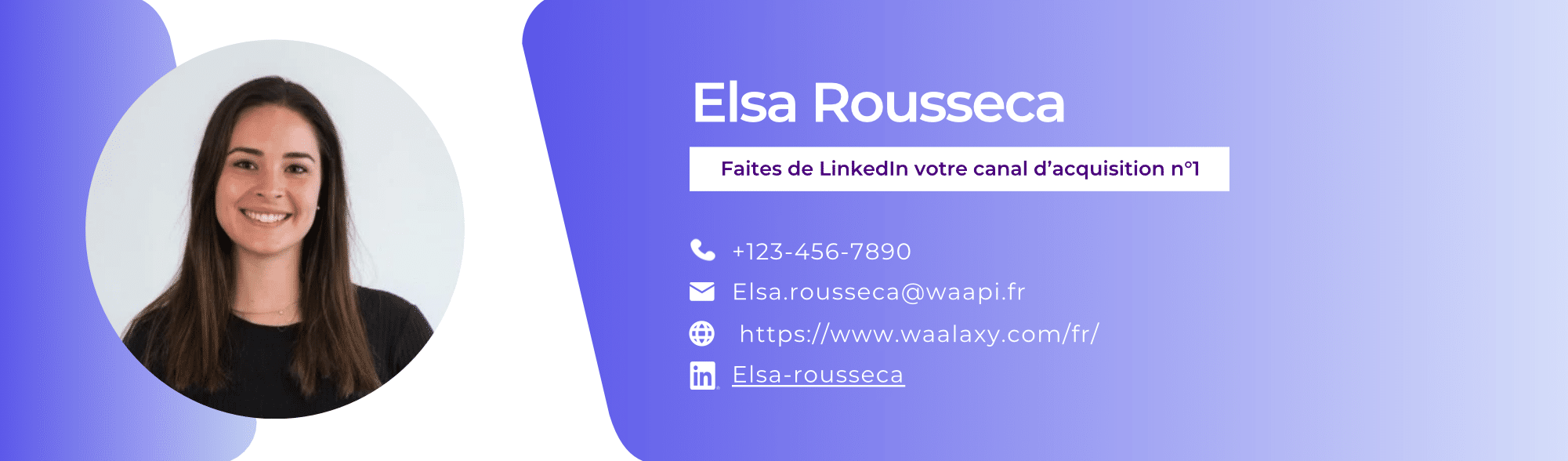
To insert LinkedIn logo email signature : download LinkedIn logo download in PNG format.
Then, in your e-mail software / address provider (Outlook, Gmail…), open the signature settings and insert the small LinkedIn logo for signature icons. Once you’ve added, select it and link it to your profile or company page.
This way, your recipients will be able to click directly on the logo to access LinkedIn. Be sure to keep the design of your LinkedIn icon for email signature sober and professional, harmonizing the size of the icon with your other signature elements.
How to use LinkedIn logo for resume?
Using the LinkedIn logo for CV is an eye-catcher and encourages the recruiter to consult your profile. You can place the LinkedIn CV icon next to your personalized LinkedIn URL, usually at the top of the CV (contact section) or in the footer.
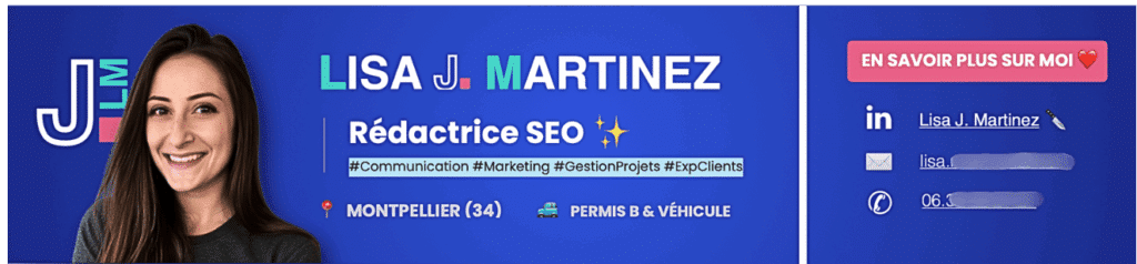
Download file with a good-quality icon and insert your LinkedIn logo on resume as an image in your Word, Canva or InDesign document. For a digital LinkedIn CV (PDF), you can even transform the logo into a clickable link to your profile.
But be careful in your usage: add small, discreet logo, so as not to unbalance the layout of your CV.
The LinkedIn logo now holds no secrets for you! ⭐️